5 Best Shopify Beauty Stores
Shopify is fast becoming the go to platform for beauty brands to build their online presence, and create their stores. As more and more businesses emerge with new, wonderful, and natural beauty products, they’re looking for a platform which is easy to create on, maintain going forward as well as be reliable in many different ways such as secure, and enables fast and easy checkout for their customers.
Shopify allows your brand to be represented really well online, store your email list, create your shop, review analytics & your revenue and, much more, and what's even better, is it's all in one place.
You can also customize your store with the use of Shopify approved Apps. This is why the platform is specifically equipped to handle ecommerce sites, and the days of coding extensive lines of code, just to achieve these customisations on your website, are over. Sorry (not sorry) WordPress. You can add customisations to your website via Apps, such as:
Adding surveys
Customising your product reviews
Customising order tracking
Adding a social media feed to your website
Customizing your cursor
… and so much more.
In this blog post we’ll showcase 5 gorgeous Shopify beauty stores that we deem worthy of shouting about! Psstt … 2 of the designs are ours, but we can still rave about them right?
But first, what makes a great store? (although you can scroll to the bottom, for the 5 best stores)
The following are only basic elements to be included in your e-commerce website, there can be a lot more to this, so it's important to tailor it to your specific business needs & goals.
1. A killer brand
When you have your branding created, such as your brand strategy and aesthetics, you will have a much stronger presence on your store. This is true for whether you build on Shopify or not, and is a fundamental part of a product based business. After all, your potential customers want to know they’ve landed in the correct place to purchase your products, and you really want your branding to be consistent across your packaging, website, and other elements.
2. Testimonials/product reviews (via photos, videos, etc)
Build trust with your potential customers, by showing plenty of reviews and testimonials, especially on your Homepage. Show them what results previous customers have achieved, and how your product has improved their lives in some way.
You can do this by showcasing a range of testimonials via copy, or even better and if possible, we’ve had clients that showcase before/after images of their customer’s results, and we strongly believe in this, ‘show, don’t tell’ philosophy.
3. Photography & product photography
Following on from the ‘show, don’t tell’ philosophy, your photography and videos are so vital to your website. These forms of content build trust with your potential customers, as visitors can quickly see what your products look like (including the packaging), who it's for, and how to use it.
"𝙒𝙚𝙗𝙨𝙞𝙩𝙚 𝙪𝙨𝙚𝙧𝙨 𝙨𝙥𝙚𝙣𝙙 𝙖𝙣 𝙖𝙫𝙚𝙧𝙖𝙜𝙚 𝙤𝙛 5.59 𝙨𝙚𝙘𝙤𝙣𝙙𝙨 𝙡𝙤𝙤𝙠𝙞𝙣𝙜 𝙖𝙩 𝙬𝙧𝙞𝙩𝙩𝙚𝙣 𝙘𝙤𝙣𝙩𝙚𝙣𝙩 𝙤𝙣 𝙖 𝙨𝙞𝙩𝙚" [𝙁𝙤𝙧𝙗𝙚𝙨, 2023]
The above quote shows that users aren’t going to spend too much time reading copy, and considering it takes seconds for your potential customer to make up their mind whether to purchase or not, do you really want to waste those seconds on having people read a lot of text.
If you can have your message come through via photography and videos, this will increase your chances of conversion.
"𝙄𝙣𝙘𝙡𝙪𝙙𝙞𝙣𝙜 𝙫𝙞𝙙𝙚𝙤𝙨 𝙤𝙣 𝙖 𝙬𝙚𝙗𝙨𝙞𝙩𝙚 𝙘𝙖𝙣 𝙞𝙣𝙘𝙧𝙚𝙖𝙨𝙚 𝙩𝙞𝙢𝙚 𝙨𝙥𝙚𝙣𝙩 𝙤𝙣 𝙥𝙖𝙜𝙚 𝙗𝙮 88%" [𝙁𝙤𝙧𝙗𝙚𝙨, 2023]
4. Website strategy
Your site strategy should be aligned with what goals you want to achieve from your website. A huge part of this is designing your primary navigation in a way, such that it follows the path/route that you want your visitors to take.
For example, and in many cases, you would want your visitors to go from Homepage > Product(s)/Collection. So the first link in your primary navigation will be a ‘Shop’ page, leading to your products or collections page (depending on the arrangement of your store).
After this, you may opt for having your ‘Best Sellers’ come next, or another page which you deem to be crucial to what you want your website to achieve.
Fundamentally, always work out what your 1-2 website goals are. Without this, you’ll create a ‘randomly’ designed website with no strategy!
Remember, you want your site to work FOR you, not the other way around!
5. A great story
Your story behind your brand is likely to be very unique to you, so it's so important to talk about it, and why you created the products that you did.
For product based businesses, especially in the beauty industry, it’s likely to set you apart from your peers.
Have a real think about the following questions:
Why did I create this product(s)?
What was my reason for creating this product(s)?
What struggles did I go through personally (if any, and there likely are!), to enable me to think of this business? (if you can include a personal story here, then do it!)
What challenges did you see in the industry/society that you previously saw no solution for?
Why was this product(s) the solution to your/those challenge(s)?
6. Ways for people to get in touch
It’s likely people are going to want to get in touch. This may be if they have questions before they buy, and you want to make it super easy for them to find your contact details.
The last thing you want are frustrated potential buyers.
Many stores include the ‘Contact’ page on the Footer of the site, and this is ok (remember the website strategy, primary navigation rule!).
7. Build your email list
This is a super important one, building a list of loyal subscribers (you have opted in to give you their email address), will help you create another company asset. You can market to your email subscribers with deals, discounts, and other news in the business, and more importantly, tailor your content as you like (unlike social media, where you’re constantly trying to satisfy the algorithm).
Statistics also show that emails have a far greater click rate, than social media.
5 Favourite Shopify beauty stores
Disclaimer: Some of the following designs (with the exception of the first two) are not ours and we take NO credit for them! They are just examples that we’ve found and loved from Google searches.
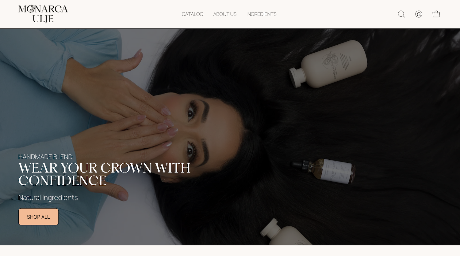
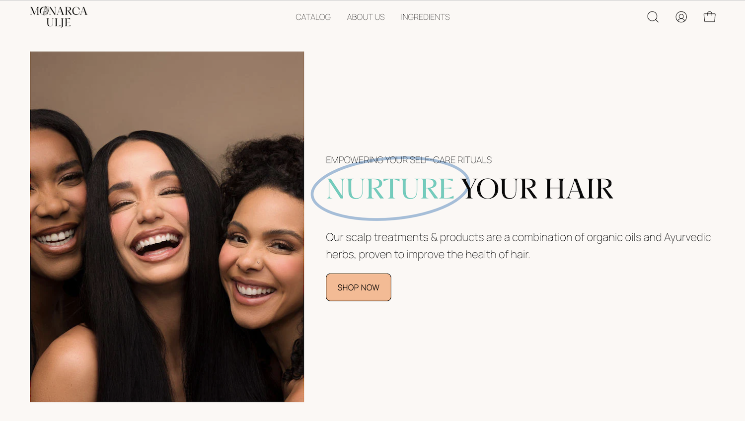
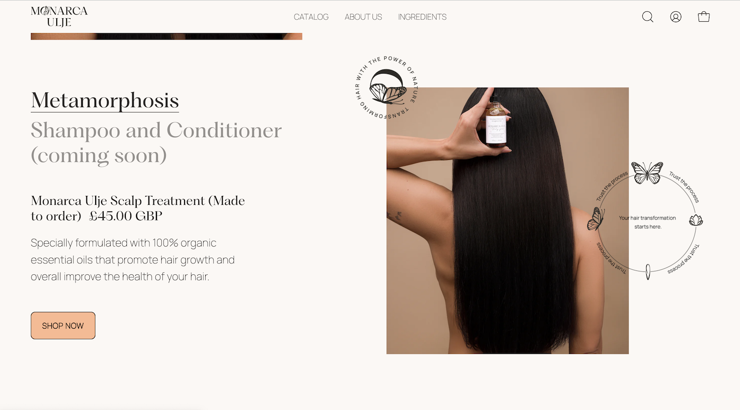
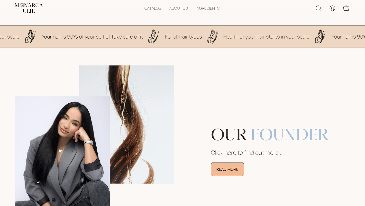
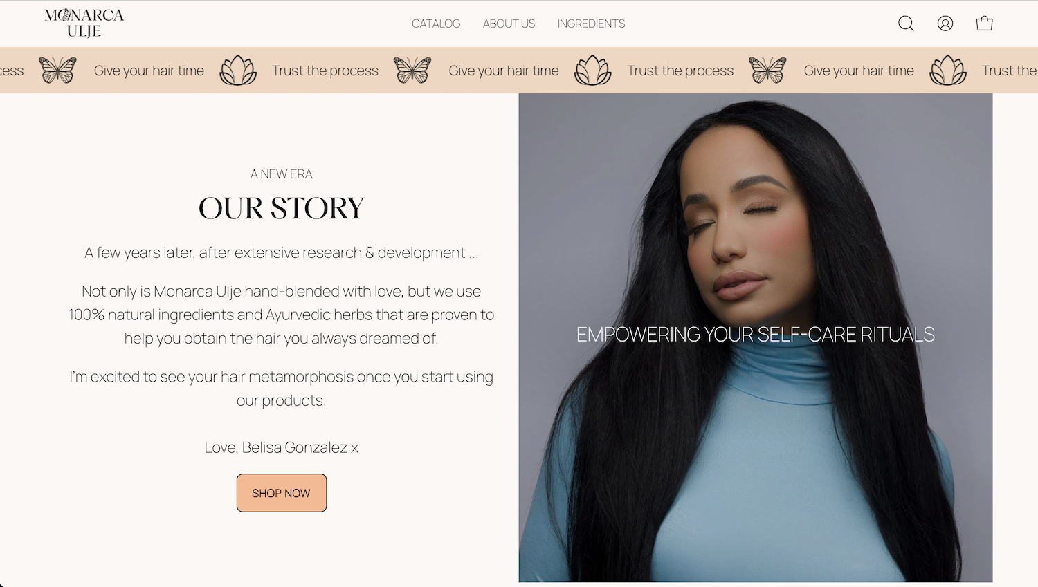
Monarca Ulje
Shopify Store For Hair Care Products
The original website was designed by us and the branding created by members from our collective of designers. We’re super proud of our client as she continues to build her brand, and a loyal following, both through social media and email marketing.
Although the branding has a vibrant and colourful personality, we kept the site quite minimal and toned down the colours a little, so as to not stray from the website goal(s).
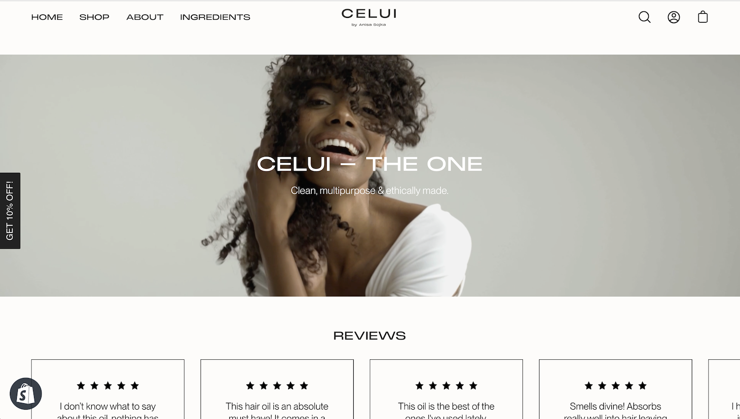
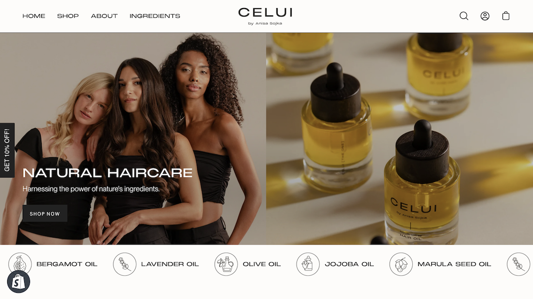
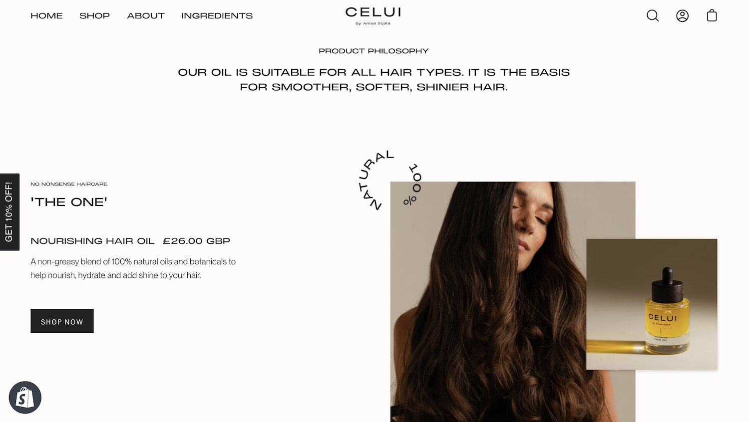
CELUI
Shopify Store For Hair Oil
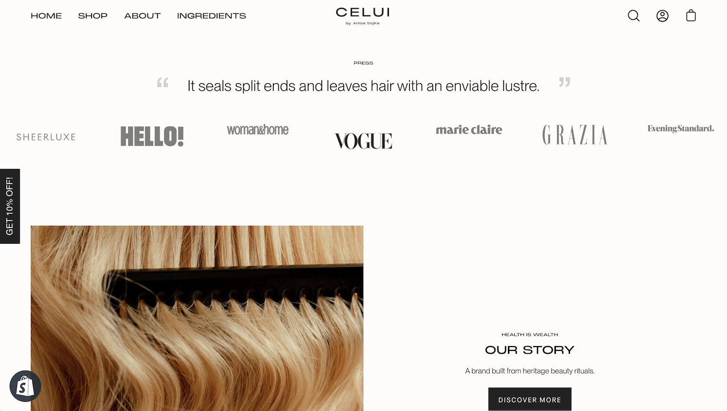
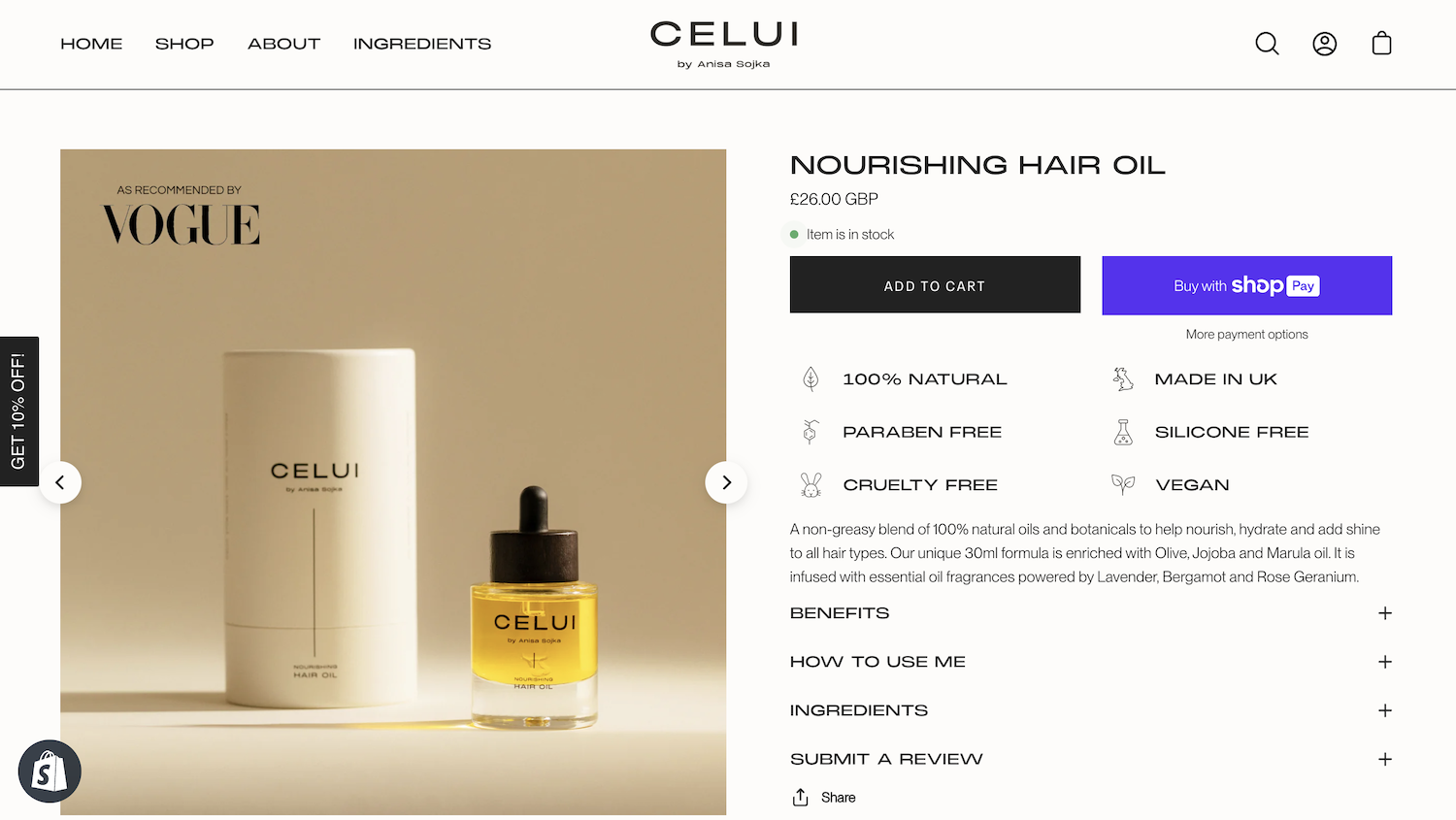
Another one of our website designs, and brand created by members from our collective! CELUI has a minimally designed aesthetic. which translated really well onto the Shopify website, and allowed us to create a lovely experience for their visitors.
They also took some beautiful photography and product photography, which was aligned with their branding guidelines, and therefore fit perfectly into the website we designed for them.
A minimal and high-end aesthetic really allowed us to market well to their ideal clientele, who want a luxurious and unique hair oil that CELUI provide.
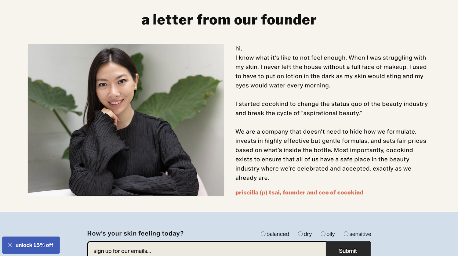
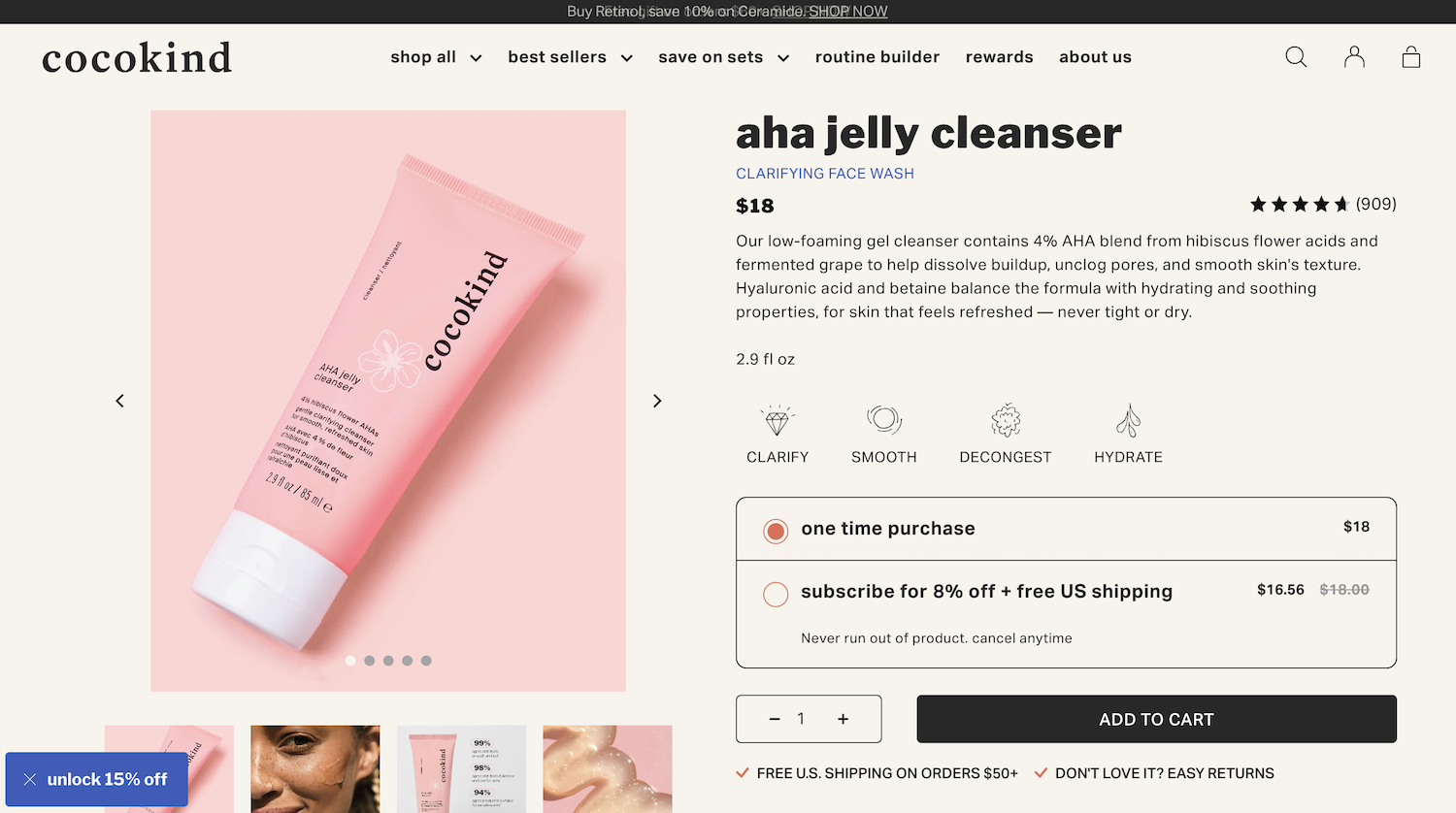
COCOKIND
Shopify Store For Skincare Products
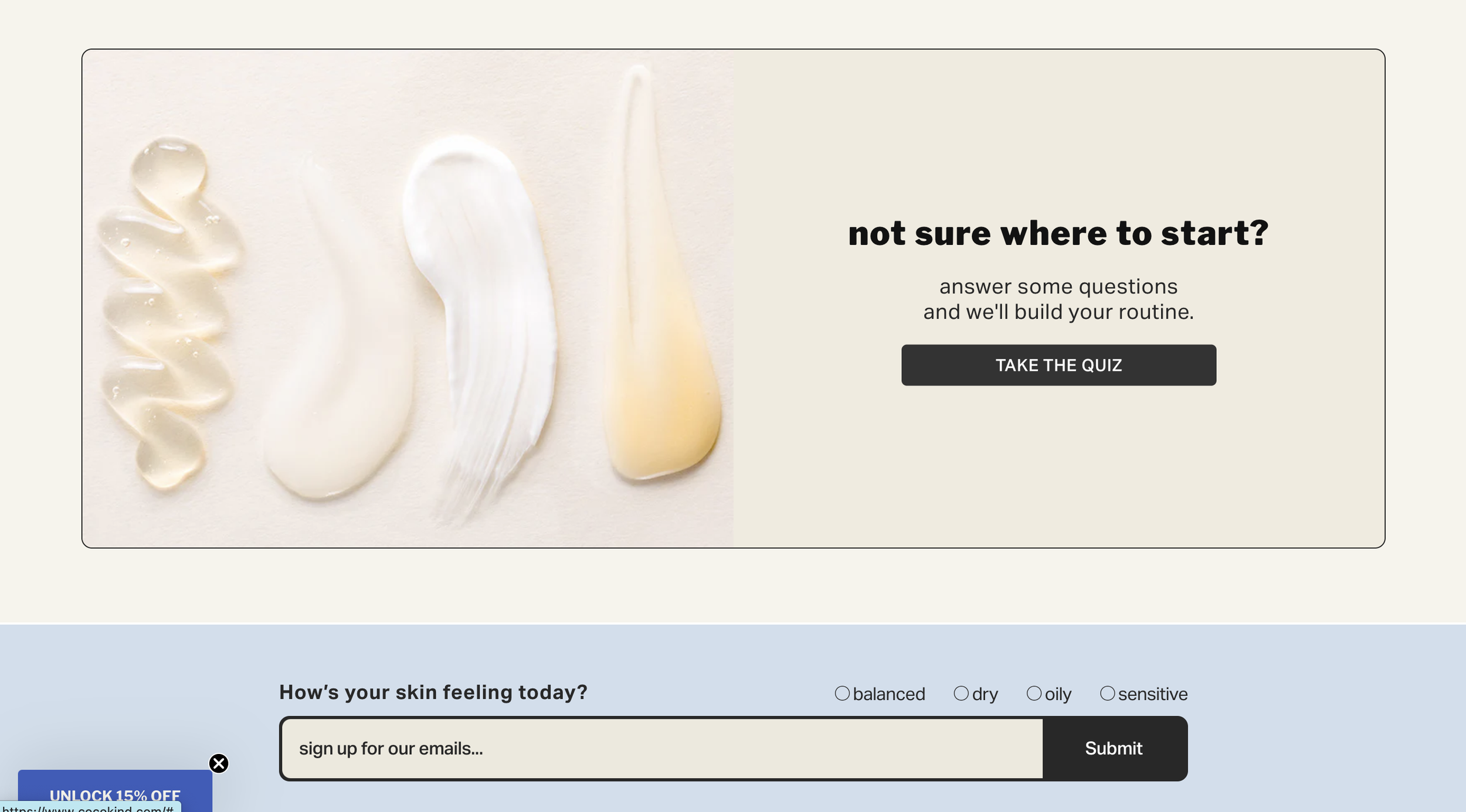
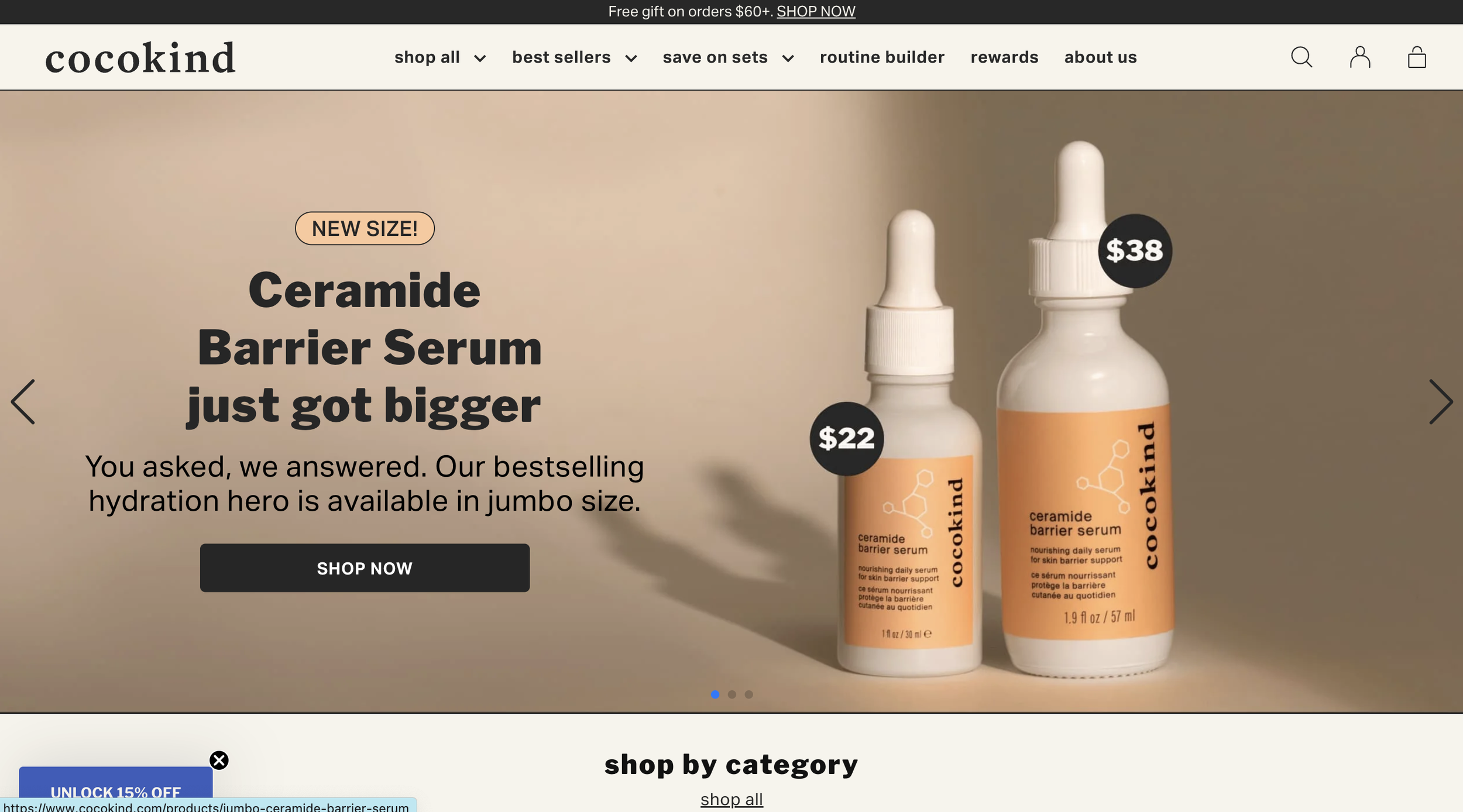
Not our design, but when I came across this website, I really loved the packaging. It’s also great how despite the vibrancy & exciting personality of the branding, they’ve kept the site minimal in aesthetics, which focuses very well on the strategy.
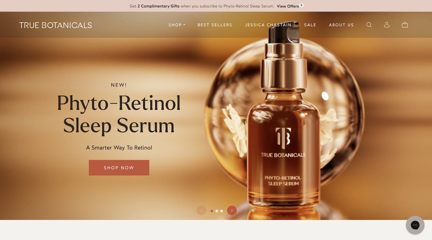
TRUE BOTANICALS
Shopify Store For Skin Care
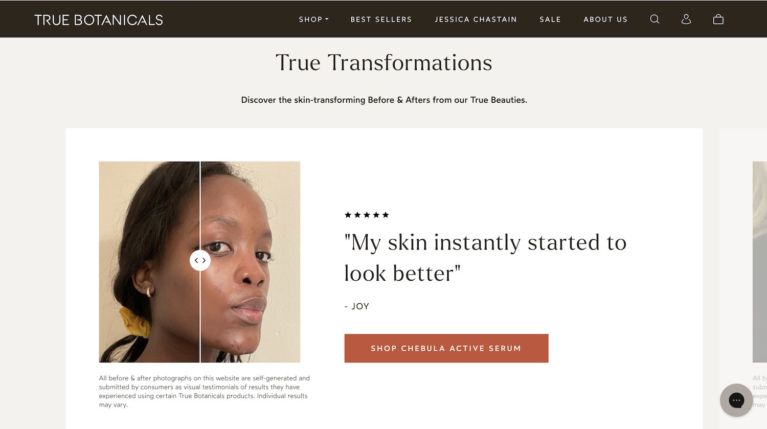
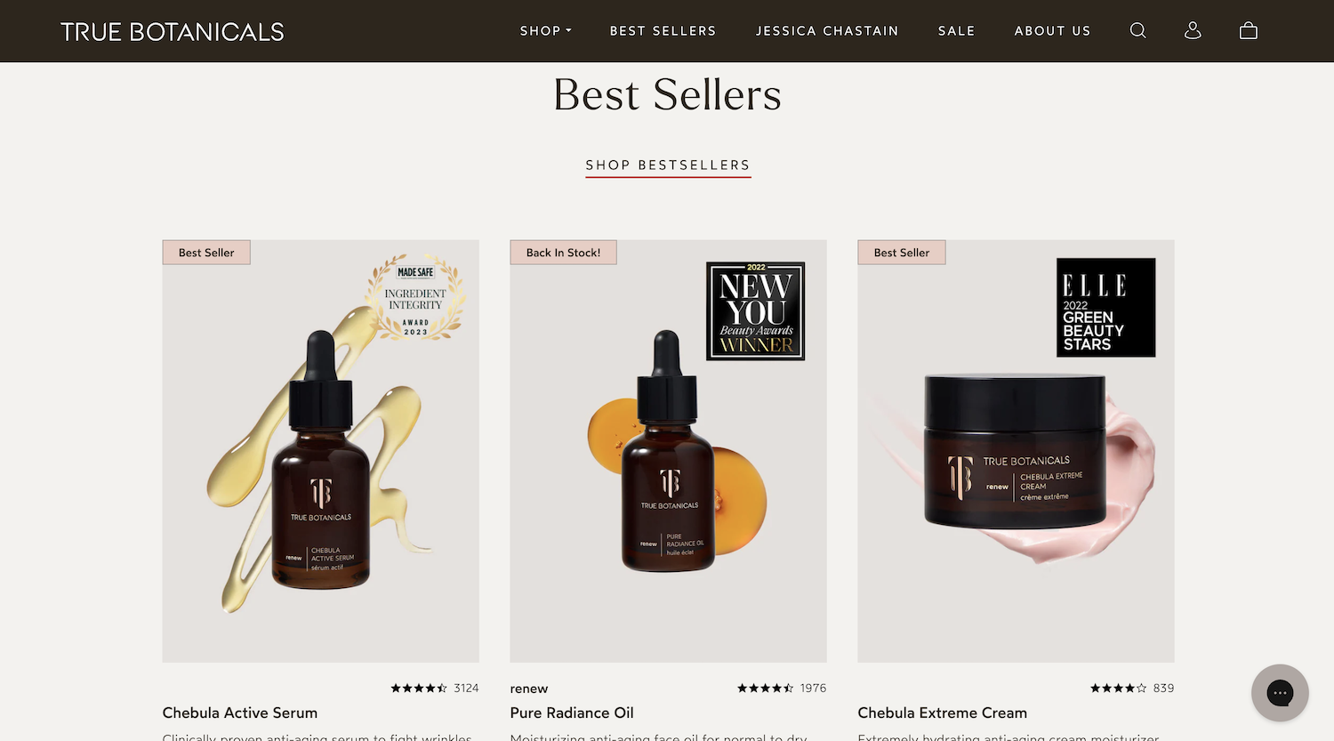
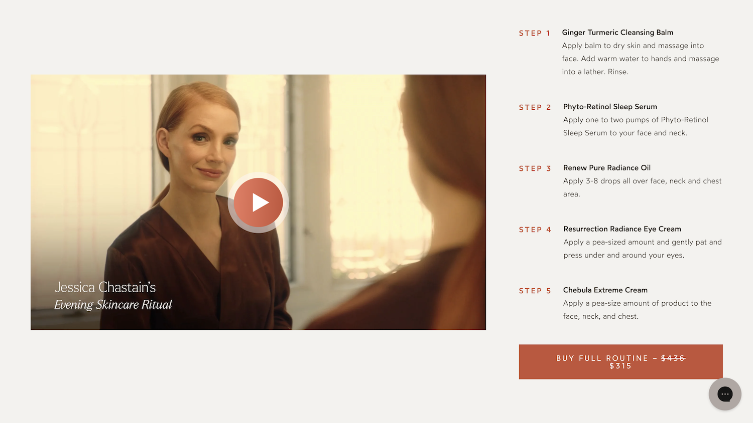
I love this website because they’ve utilised so much photography and videos, to show their products in use. Least of all, Jessica Chastain endorses the product, and they’ve dedicated an entire page to her! Definitely a great marketing idea!
They have used photography in their testimonials to show people’s transformations, rather than text testimonials alone. Photo/video testimonials are very effective when your prospect customers want to see what results they can achieve too.
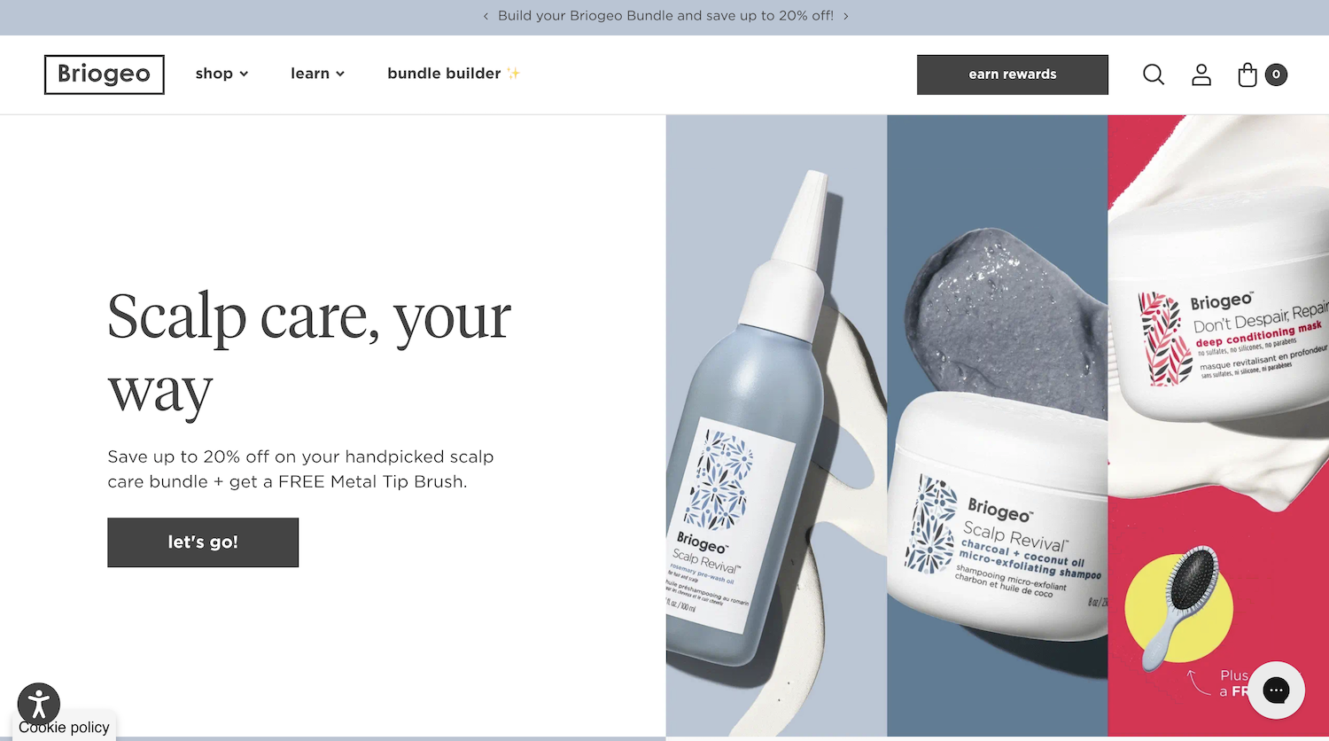
BRIOGEO
Shopify Store For Hair Care Products
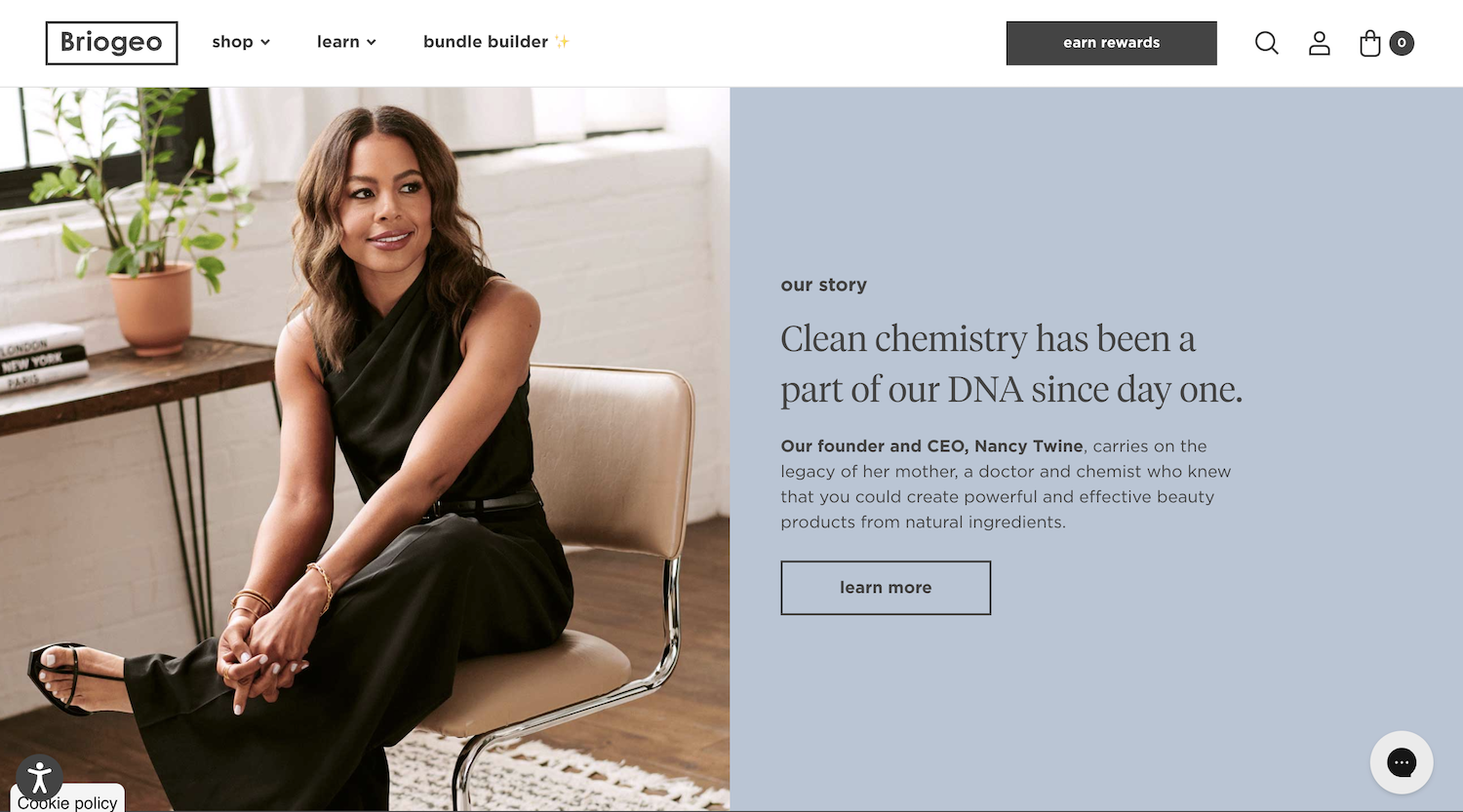
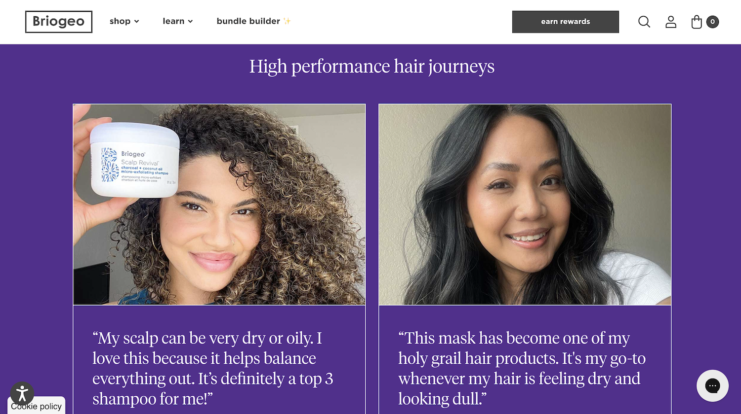
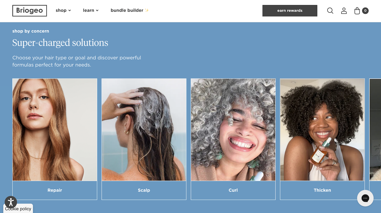
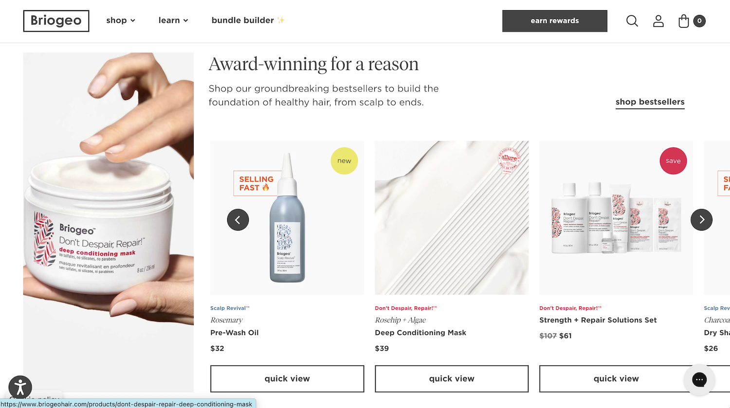
Really love the minimalist design of this website too. They’ve clearly got lovely packaging design, using vibrant colours, however, the site is kept clean with the vibrant colours used in sections and sparingly.
White space is used well, they’ve invested well in product photography, and have showcased photo testimonials to show real people benefiting from the products. Using the ‘show, don’t tell’ concept well.


