
How many primary navigation links in minimalist web design
Your primary navigation bar is the ‘main menu’ for links to other internal pages within your website, and sits at the top of your homepage and website. Within a minimalist web design, you should focus on only the most important pages within this navigation design, and the less important pages need to be removed from this main website menu.
Ideally, you want to include no more than 7 links within your primary navigation menu, where 4-5 is preferable.
We have also touched on this topic in previous blog posts - How to introduce yourself on your website.
How do you Determine Important Pages?
Once visitors have landed on to your homepage, decide where it is that you want your visitors to click to next. This is how you will determine which links are the most important for your business, and therefore need to be included at the top of the page.
This will be strongly determined by your website goal(s). For example, your goal(s) could be … :
To sell physical products.
For people to complete an online booking form.
For people to complete your contact form, or arrange to phone you.
To build an email list.
In addition to this, think about whether or not you have a portfolio of previous work or something similar, that you need to show to your prospective clients. This would be classed as an important and primary page.
Or in the case of ecommerce, your primary navigation will include links to a product page(s).
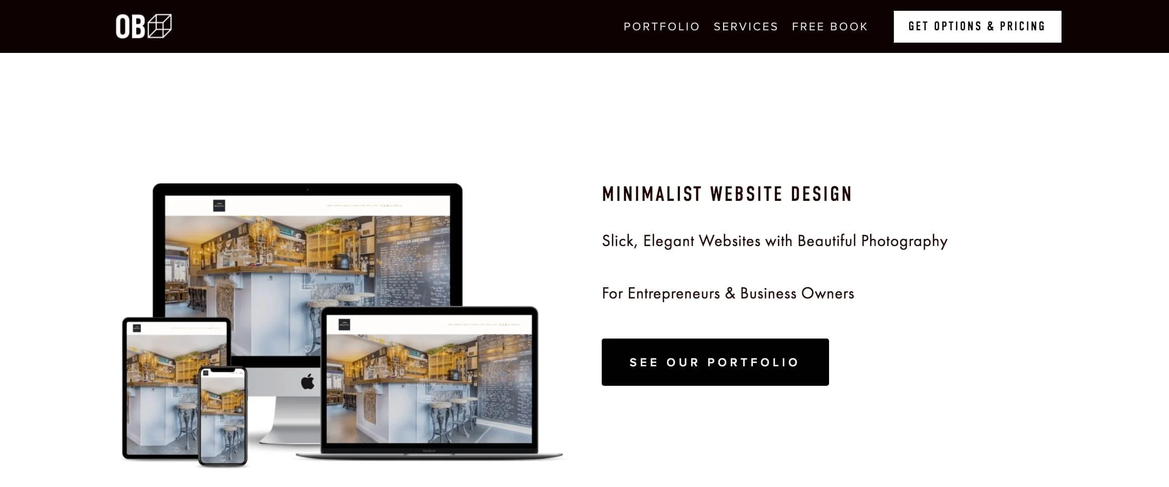
The primary navigation bar content will look different for professional services compared with that of an ecommerce business. However, the overall concept of keeping to between 4-7 pages can be universally applied.
Some examples have been provided below, where both show a maximum of 6 links within the primary navigation bar, including links to social media pages.

Examples

https://www.haagen-dazs.co.uk/

https://www.ipsewilderness.co.uk/
Roadmap It
Get into the shoes of your ideal and prospective clients. After landing on the homepage, and by thinking as logically as you can, where do you want them to go next? What is the best route for them to take to achieve your site goal?
This will be your website roadmap.
Example
This could be a defined roadmap for a business offering professional services such as a web designer, a graphic designer, an architect, etc:
Home > Portfolio > Services > Book a free consultation
It can be made as simple as this for a minimal website layout.
Less is More
Check out our other blog post on this topic, but when you provide less choice within the primary menu for your website users, then you’re aiding your visitor in focusing on only the most important links.
Psychology studies that have been performed in the past, most famously the Jam Experiment, have proven that once people are presented with too much choice, they are likely to make no choice at all.
Similarly if irrelevant links are provided within your primary navigation bar, then there is an increased chance that your user will not choose the links which will eventually lead to your product pages, contact pages, etc.
For example, you don’t want a link to your ‘blog’ next to a link to ‘contact’ you on the top of the page. The ‘contact’ page takes precedence here. The link to your ‘blog’ page can be moved to the footer of the website, as shown by the below example.

The same studies have also shown that people love to have more choice, and you’re likely to find this if you ever conduct user testing or any form of research for your site. However, this often causes choice paralysis amongst users, where due to the increased feelings of pressure and overwhelm, they are less likely to actually make a final decision.
Time is of the essence
Visitors will typically spend up to 3 minutes browsing your entire website, and on average it is no more than this. In fact for mobile phone users, this may be even less, and has been found to be on average as little as 1 minute.
The latest data (2019) shows that mobile usage to access websites is strongly on the rise, and well ahead of the number of desktop users. However, users will typically spend more time engaging on and with websites using desktops, in comparison with when on their mobile devices.
% Time Spent on Websites
This only goes to show that your main website menu needs to be kept to a minimal design and layout, and with minimal content. People do not have a lifetime to spend on a website, and your site only has a limited time in which to convey the relevant information to ideal clients. Especially when they’re on their mobile phones.
You want to create a website that is completely aligned with your site and business goals. Regardless of the industry, a web design should be kept completely to the point, with as little distractions as possible for the user.
Naming the Pages
Our motto is to keep it simple when it comes to naming the pages. The names should be easy to understand by the user. Again, bearing in mind the 3 minute max concept.
Alternative names for such terms like ‘Portfolio’ or ‘Contact’ can be used. Terms like ‘Projects’ and ‘Get in Touch’ are absolutely fine, however, if in any doubt, keep to the simplest language and keep to the point.
You may even decide to include a Call to Action (CTA) within your main navigation bar, for example ‘Book a Call’ or ‘Get in Touch’. Place your navigation links in the same order as your website roadmap as the most logical and simplest option.