5 Best interior design websites using Squarespace
Keep scrolling for the 5 best interior design websites,
or watch our video below, on the 3 must-have pages for a winning portfolio website.
If you’ve popped along to this blog post, chances are that you’re looking for the best interior design websites for some inspiration! We’ve been through Google and have done a little research in order to present to you 5 of the best interior design Squarespace websites 🤩
Squarespace 7.1 is one of the best platforms for designers and creatives with all of the available templates being as versatile as the next! In fact, if you’re choosing to DIY a Squarespace website, version 7.1 has many templates to choose from.
However if you’re choosing to customise it or are hiring a website designer, each and every template can achieve exactly the same design as what we’ll show to you in the rest of this post.
But how do you choose the right template in the first place? The best website designs have some common factors that you always want to look for.
What makes an amazing interior design website?
We look for a minimalist design and a great user journey strategy. What does this mean? Well, here are some tips for a clean and simple look:
Including only the most necessary elements
Increased negative (or white) space
Including only the most necessary copy
1-2 chosen calls to actions (CTAs)
Maximum 7 links in the primary navigation
For the benefits of a minimal and clean website, here are some of our other blog posts you can read:
Here are some of the best interior design websites we’ve found!
Below are 5 examples we’ve found and chosen
These chosen examples are in no particular order!
For each website, we’ll leave a link to the site and which version it was designed on (remember, even if the website was designed on an older version (7.0) template, you can achieve the same exact design with the latest version (7.1) of Squarespace).
Disclaimer: The following designs are not ours and we take NO credit for them! They are just examples that we’ve found and loved from Google searches.
This site was designed using version 7.0.
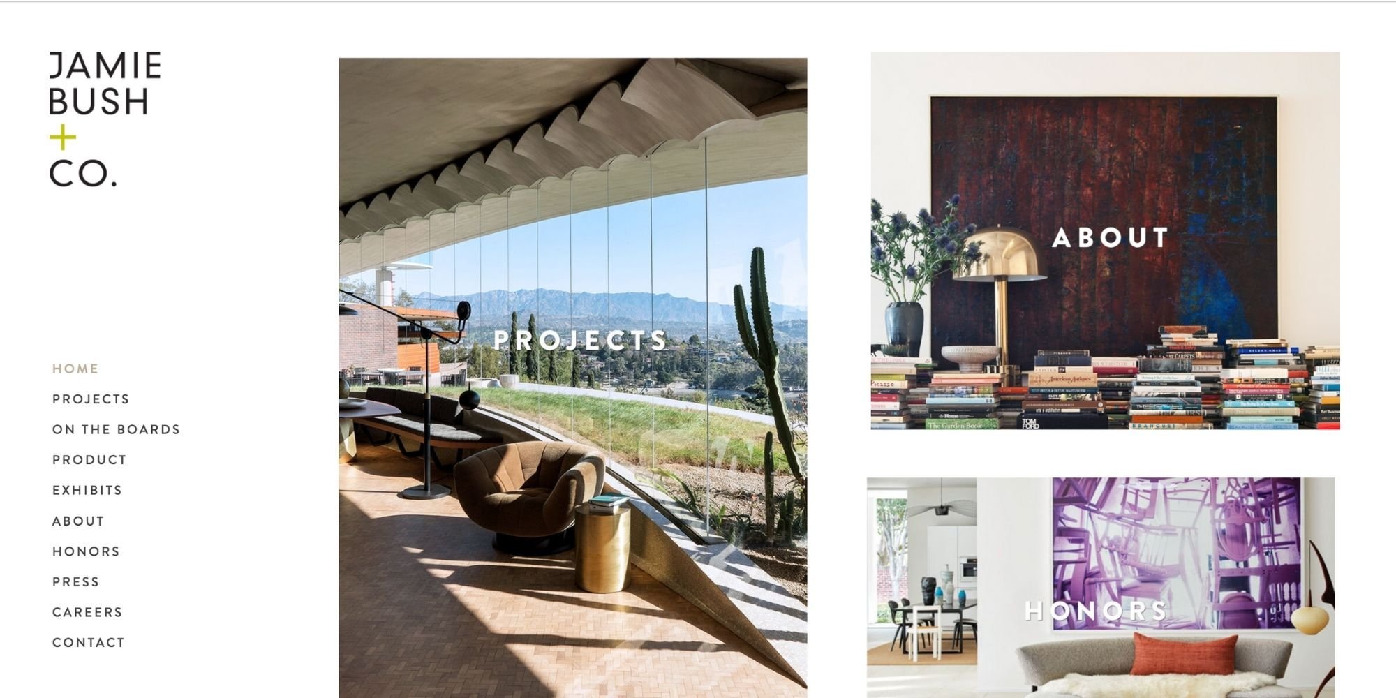
The site is a little different in it’s design, where you are presented with an ‘enter site’ call to action, and the first thing you see are some beautiful images from the designer’s portfolio. No other text and the photography does the talking. The primary links are along the left hand side (and not along the top as is the traditional design), and although the number of links exceeds the preferred max of 5, the main page follows an intended user journey.
We’ve created the Interior Designer’s Portfolio Checklist!
Download for free!
This site was designed using version 7.0.
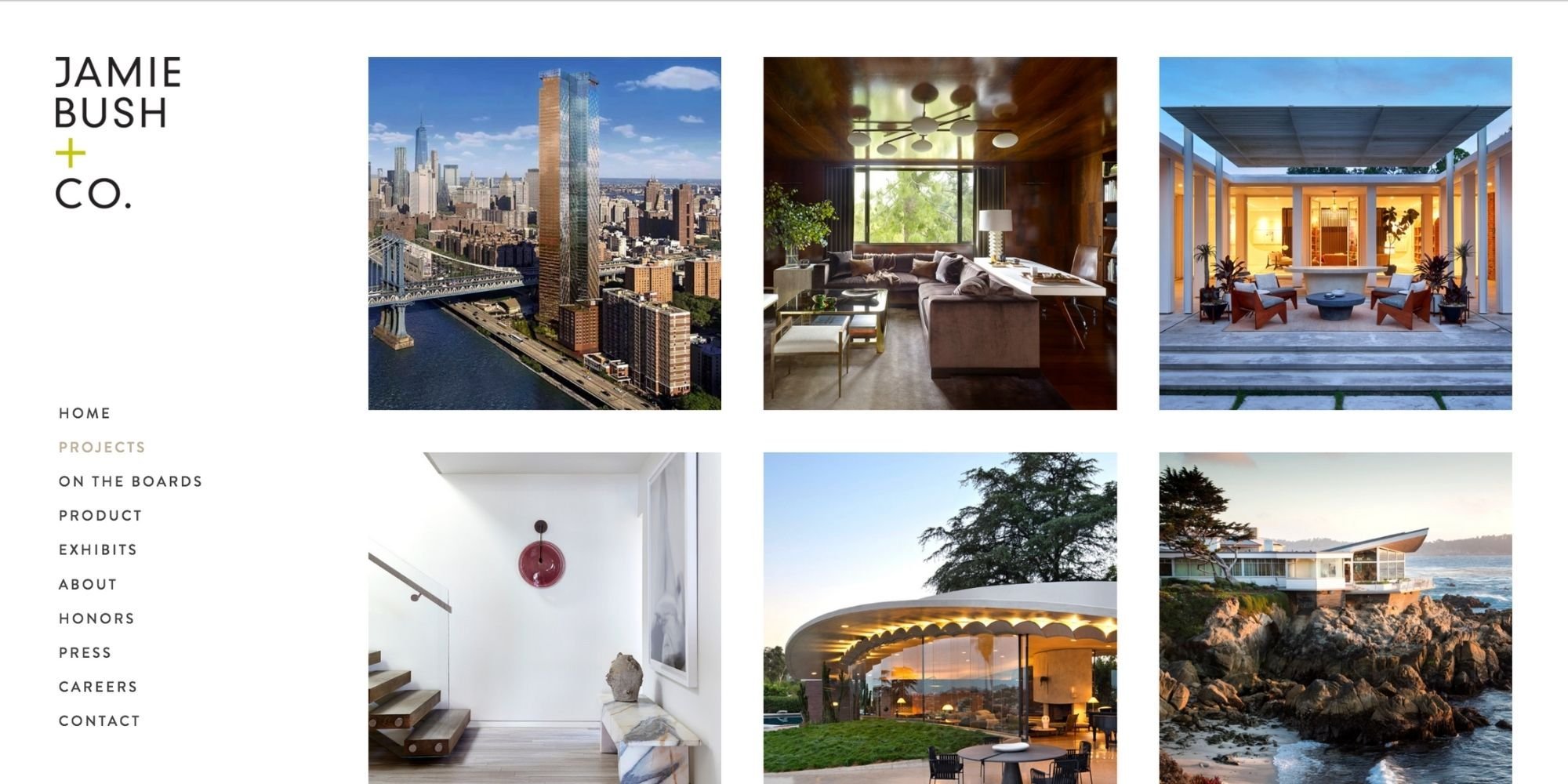
Once again, when you first land on the homepage, we see no copy and just one call to action, which is to ‘explore’ the designer’s projects. The photography of previous projects does most of the work to speak to their ideal clientele, and the site follows an intended user journey.
Once again, the number of primary navigation links exceeds our preferred max of 5, but the design is clean, simple and effective in its look.
This site was designed using version 7.0.
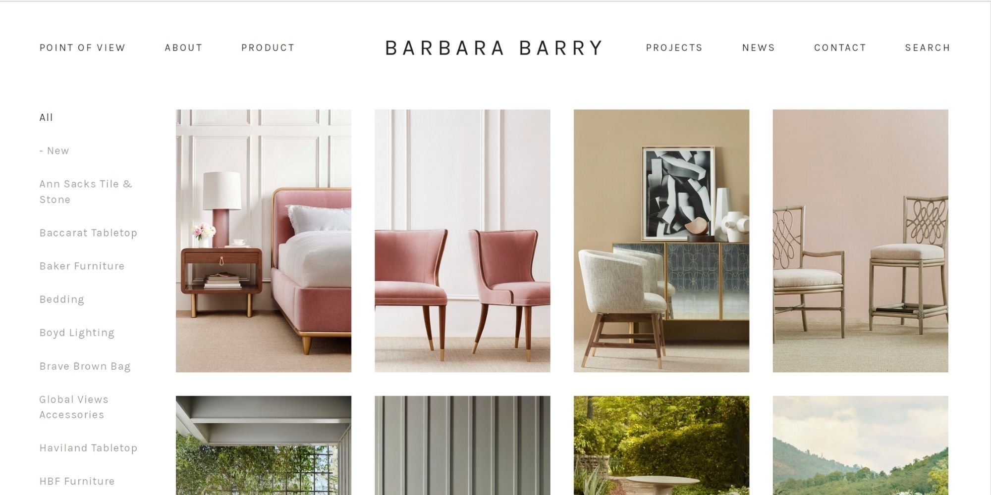
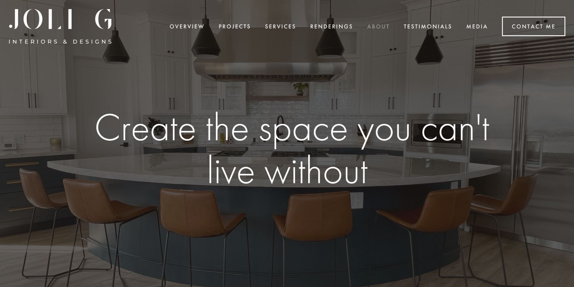
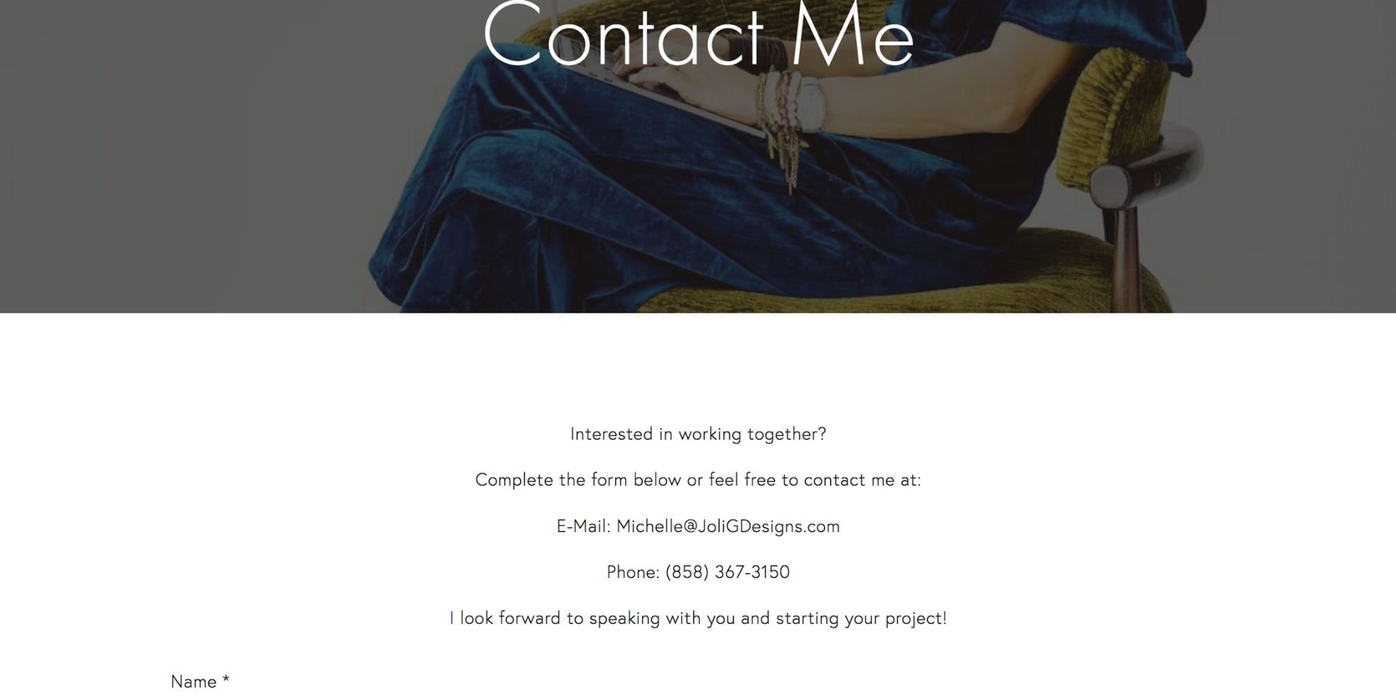
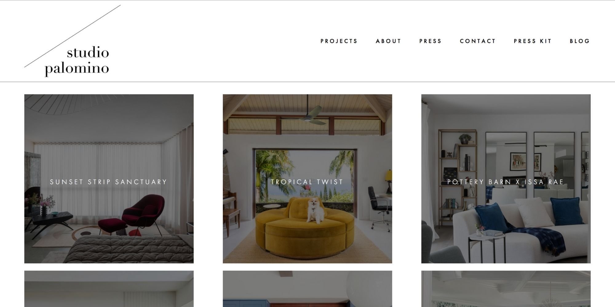
The site starts with a beautiful banner image with a short tagline and some copy as you scroll. The remainder of the homepage is a long scrolling page of previous projects, and each image links to that previous project.
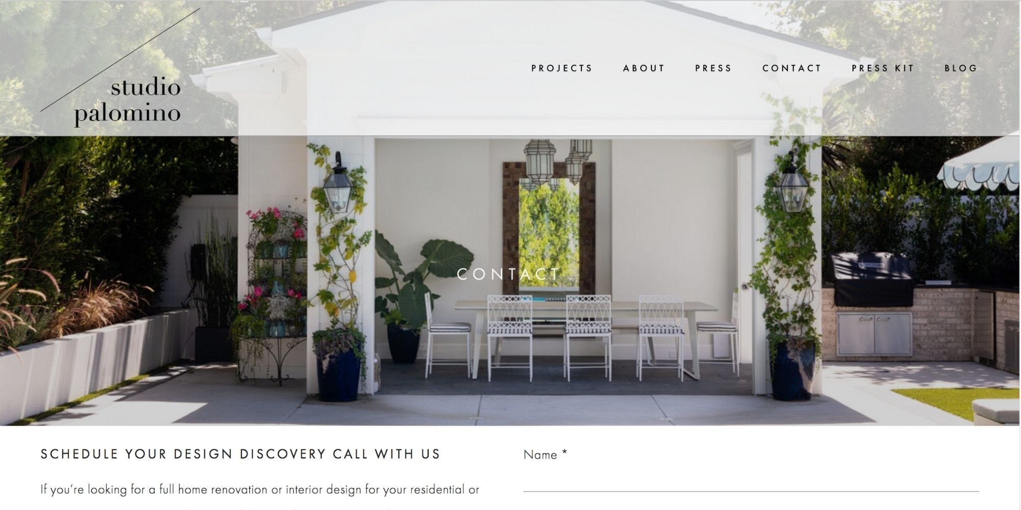
The call to action for ‘contact me’ is visually bolder along the primary links, highlighting this to be the end goal of the user journey.
This site was designed using version 7.0.
The designer’s brand and logo is represented well on this website. With a slideshow banner image showcasing multiple projects for the user to see quickly.
There is no main call to action above this slideshow but it’s clear that the user is supposed to follow the journey along the primary navigation.
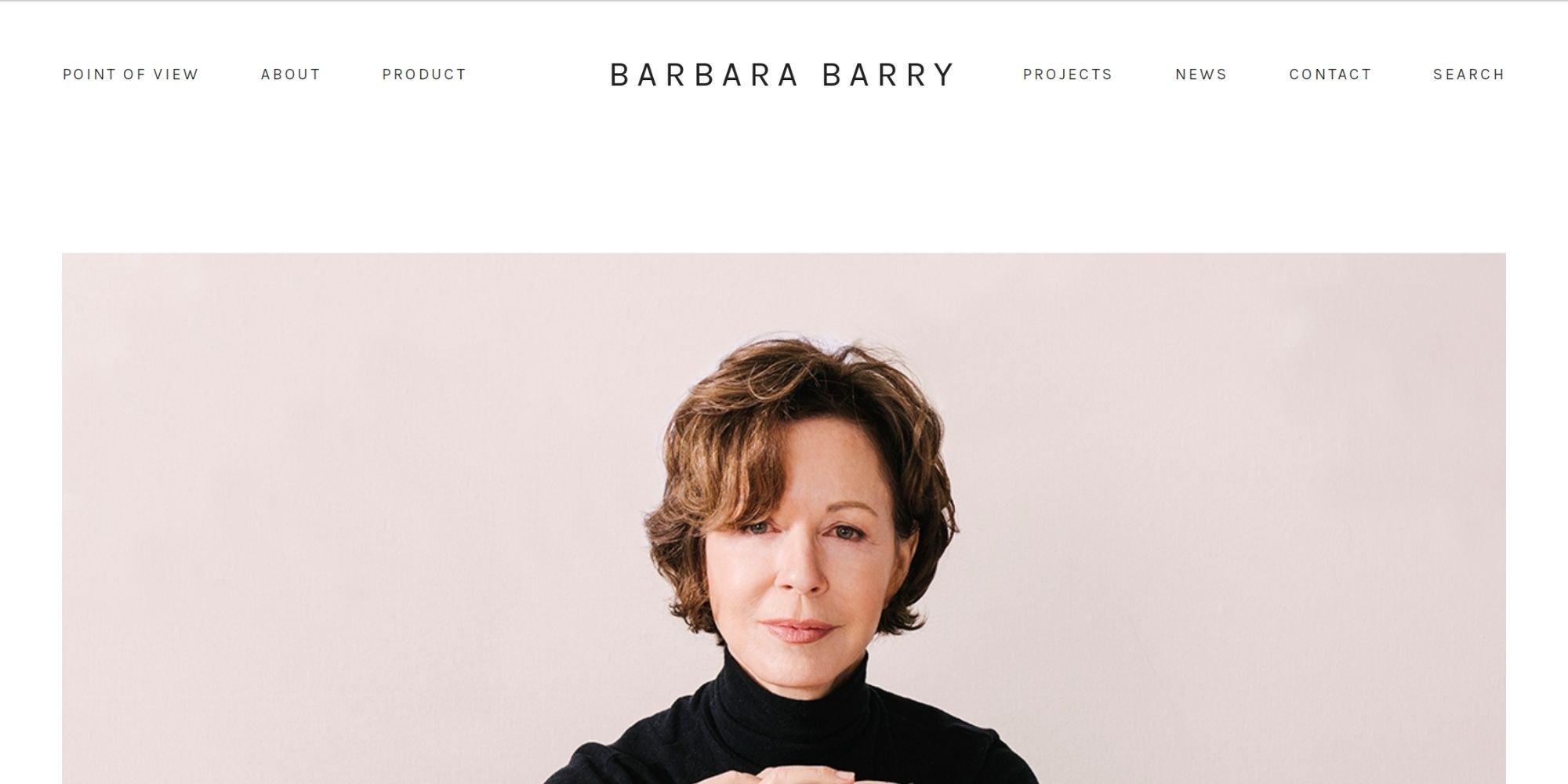
The design is clean and slick, utilizing plenty of negative space.
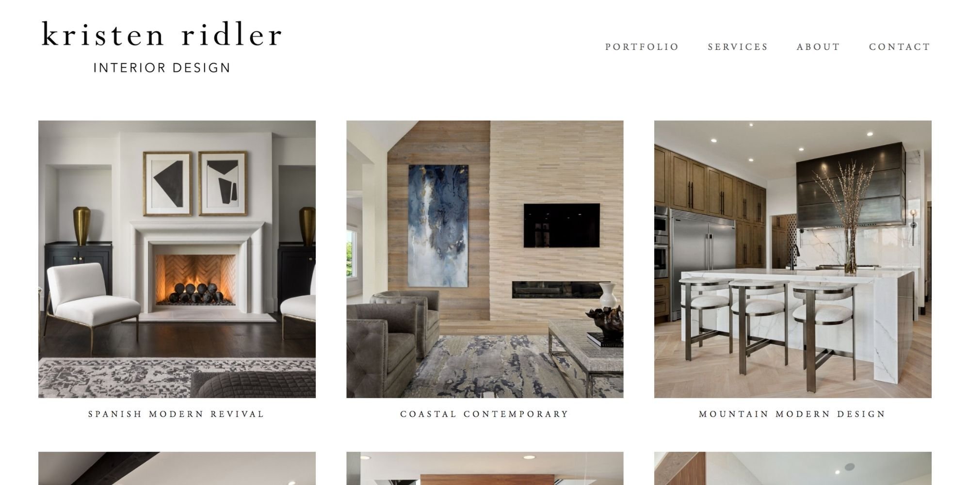
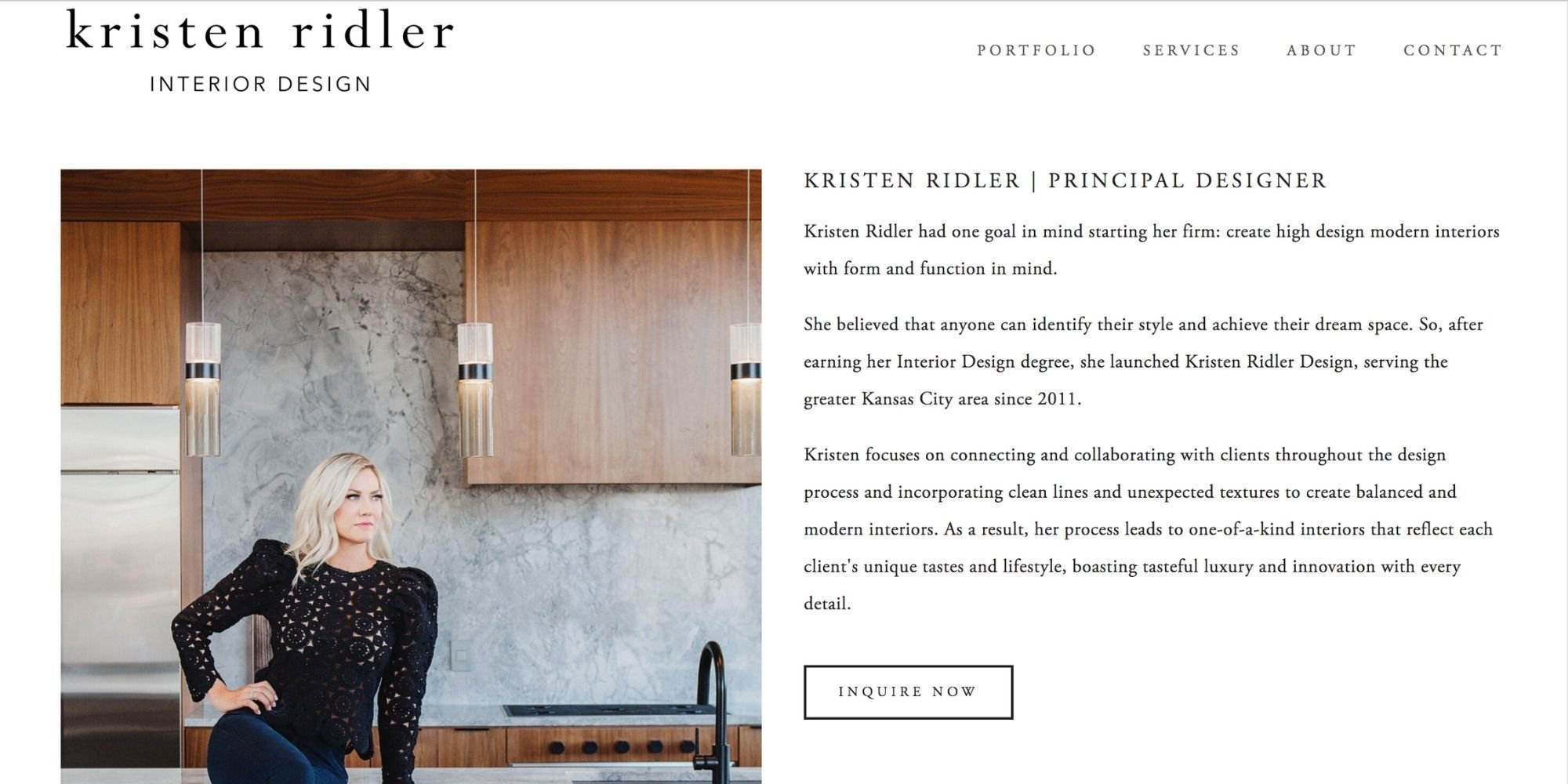
5. Kristen Ridler Interior Design
This site was designed using version 7.0.
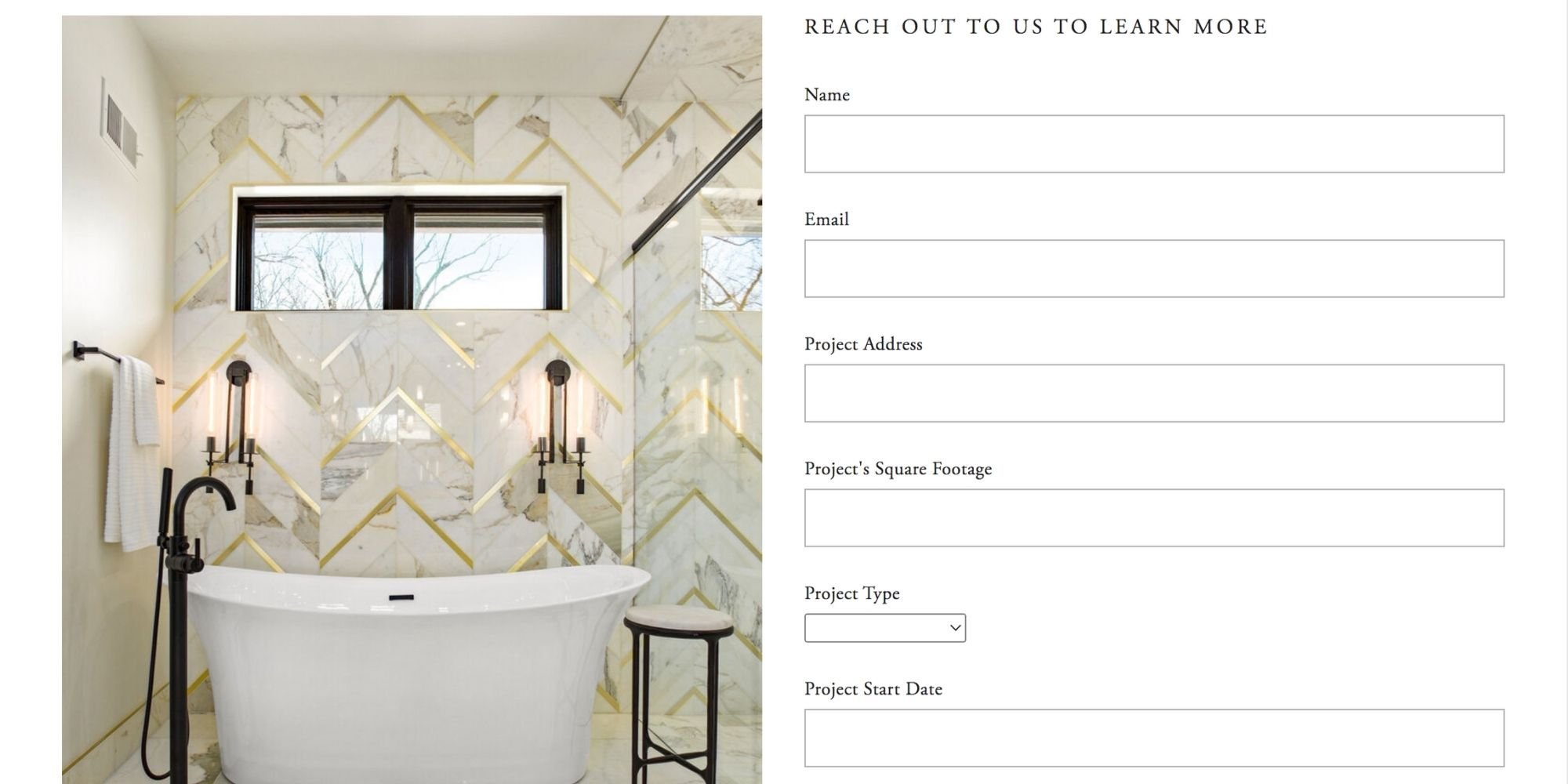
This site follows the ‘minimalist’ number of links in the primary navigation! There are only 4! This makes the user journey such a simple one (aka minimalist). With the contact page being the end goal of this user journey.
The homepage is short, with a slideshow again and one call to action! Which sits boldly on the banner. This website is minimal throughout, utilizing plenty of white space and well placed calls to actions.
So we hope you enjoyed taking a look at these examples of beautiful interior design websites! We actually really love doing this research for you, so you don’t have to!
If you’re an interior designer, and are looking to step up your website to a whole new level, then give us a shout. You deserve to have your work and brand be showcased beautifully on a website, and also one which increases leads and sales from your dream clients.
