5 Top Squarespace wedding photography websites
There are so many beautiful Squarespace photography websites out there, and in this post we’re going to explore five minimally designed websites, chosen specifically for wedding photographers. Honestly, we could have kept going and perhaps found hundreds of websites, but we’re after the best ones which have caught our eye due to their cleaner aesthetic. After all, we’re all about the minimalist design over here at OB!
If you’re interested in exploring more photography websites designed on Squarespace, check out our other blog post too (Photographers using Squarespace | 5 best examples).
Creative professionals such as wedding photographers deserve to have their brand and aesthetic showcased very well online. There is so much potential once you get going with an accurate online representation of your business, and who’s to say you could make global reach (only if this is what you want of course!).
As a wedding photographer, you’re selling a service to a very special occasion! The happy couple are going to have one of the most important days of their lives, and you want a website that when your ideal client lands on it, they want to hire YOU to document it! A site which shows off your unique ability and personality, as well as your special brand message which sets you apart from everyone else.
Squarespace is one of the best (if not, THE best) platforms for ALL creatives. We’ve chosen the following based on several factors which follow the minimalist strategy.
What makes a minimalist website?
This is a site which follows some basic principles, such as:
A primary navigation consisting of no more than 7 links
A lot of negative space; this can be used to break up the text, images and graphics
Minimal copy; only using the core information needed
Minimizing the element of choice for the site visitors; by minimizing calls to actions (CTAs), you’re only leaving your visitors a limited choice for where they can go next, thereby staying true to your user journey
5 Top Squarespace wedding photography websites
We’ll list each of the 5 which we’ve scoured Google for and found, along with a link to the live site, and whether the site was built using Squarespace version 7.0 or 7.1. (the list is in no particular order!)
Disclaimer: The following designs are not ours and we take NO credit for them! They are just examples that we’ve found and loved from Google searches.
Website: Jordan Fox Photography
Designed on version: 7.0
As soon as you land on the homepage, you’re presented with a beautiful photograph and logo. There are no more than 4 primary links (excluding social links), clearly following a user journey, with the end destination being to ‘enquire’ with the photographer. Those links which aren’t as fundamental to the user journey have been moved to the footer, which is great!
The design itself incorporates plenty of white space (we love that there’s a lot used!), with a mix of copy but plenty of imagery showcasing the photographer’s work.
The branding is beautiful and consistent throughout, appealing to a certain ideal clientele. CTAs are shown throughout as well, constantly reminding the user to take some action.
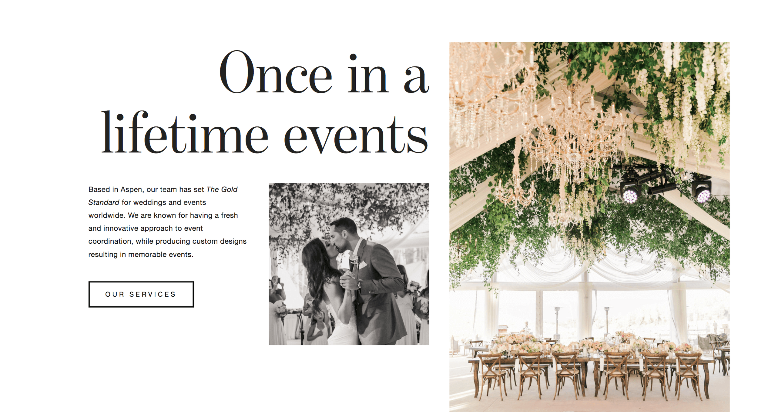
2. Website: Gold Leaf Events
Designed on version: 7.0
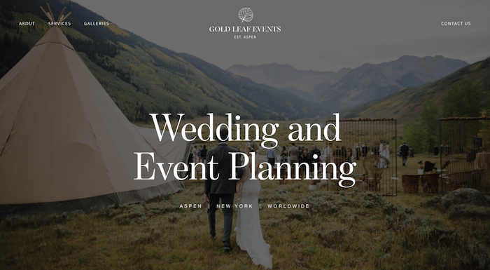
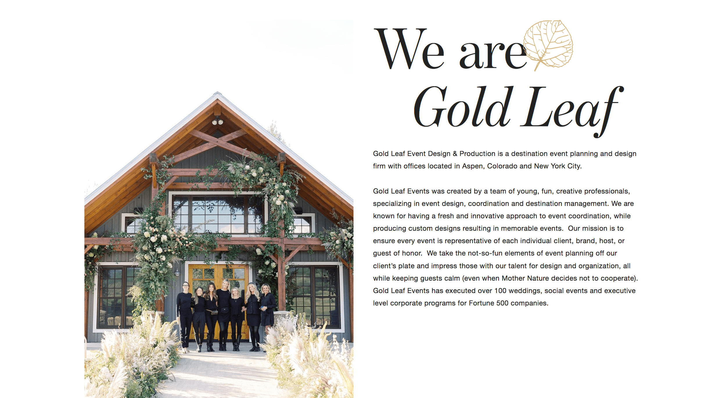
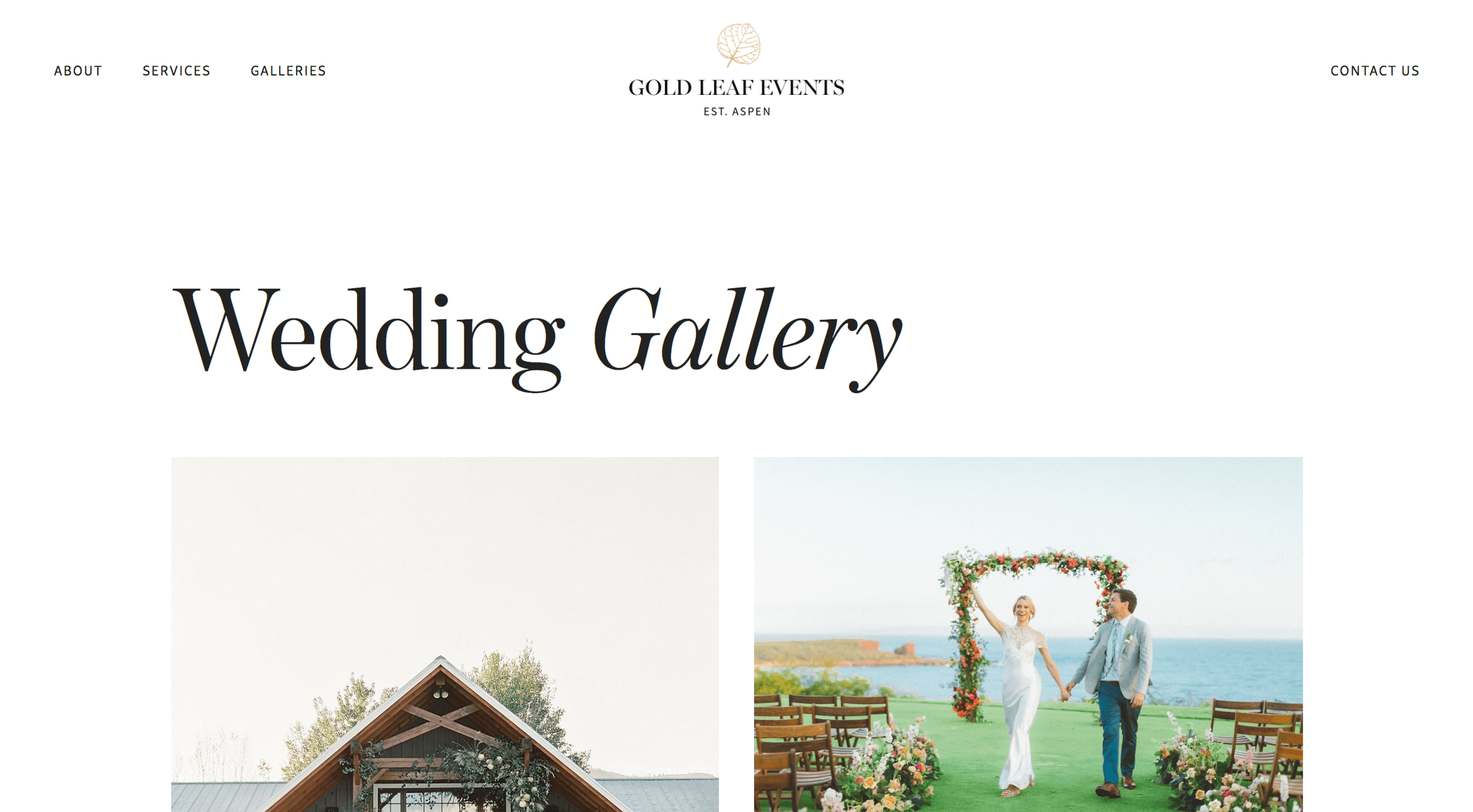
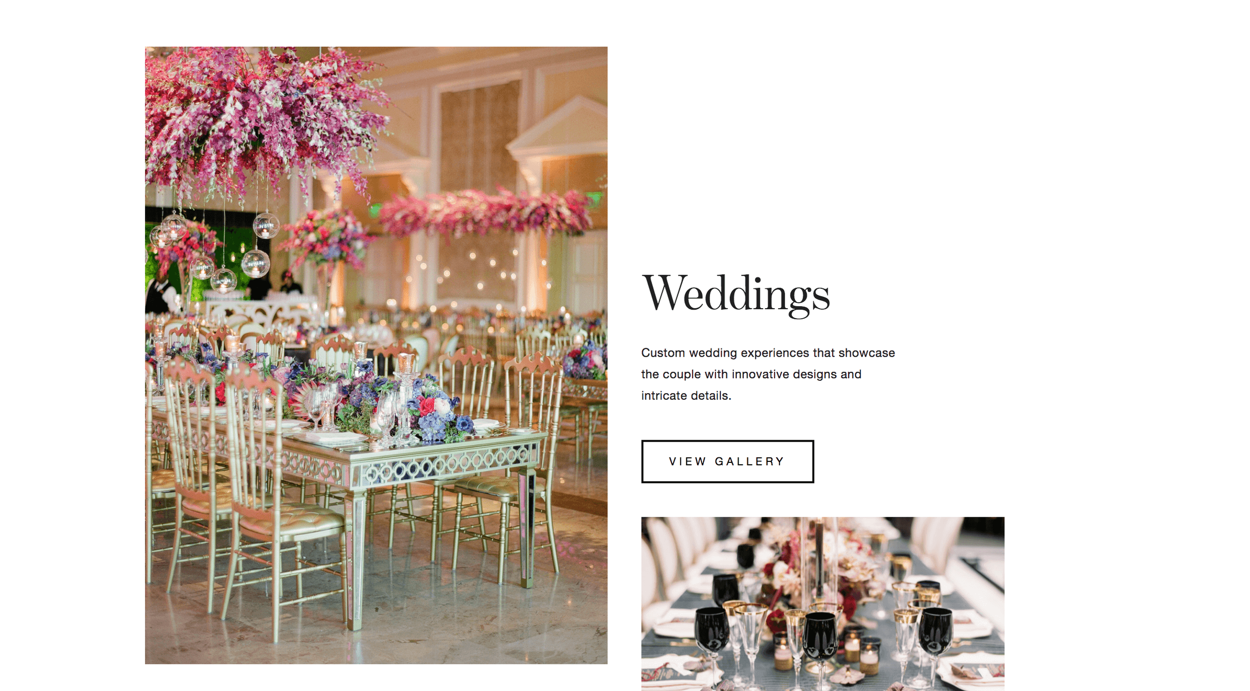
Once again the number of primary links is kept to only four, and the banner image seen first thing is so beautiful. The ‘contact’ link is kept to the other side of the logo and on its own which makes it stand out. The copy is super minimal, and the user’s eyes go straight to the core content due to the good amount of negative space used.
CTAs stand out, once again because of the abundance of white space!
We love the nature vibes!
3. Website: Spera Special Events
Designed on version: 7.0
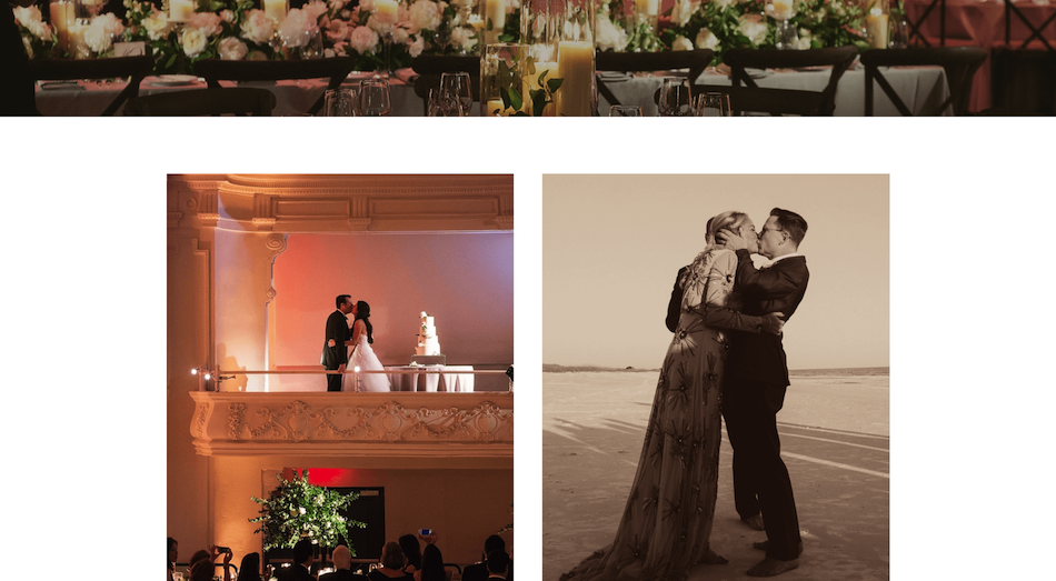
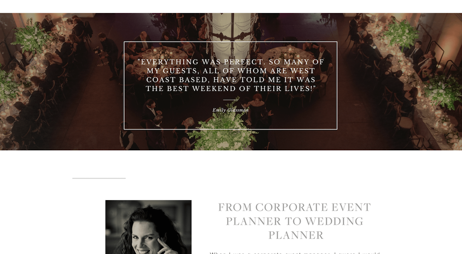
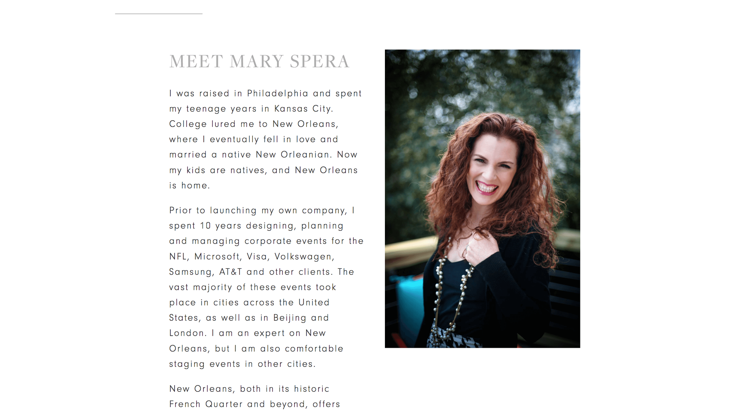
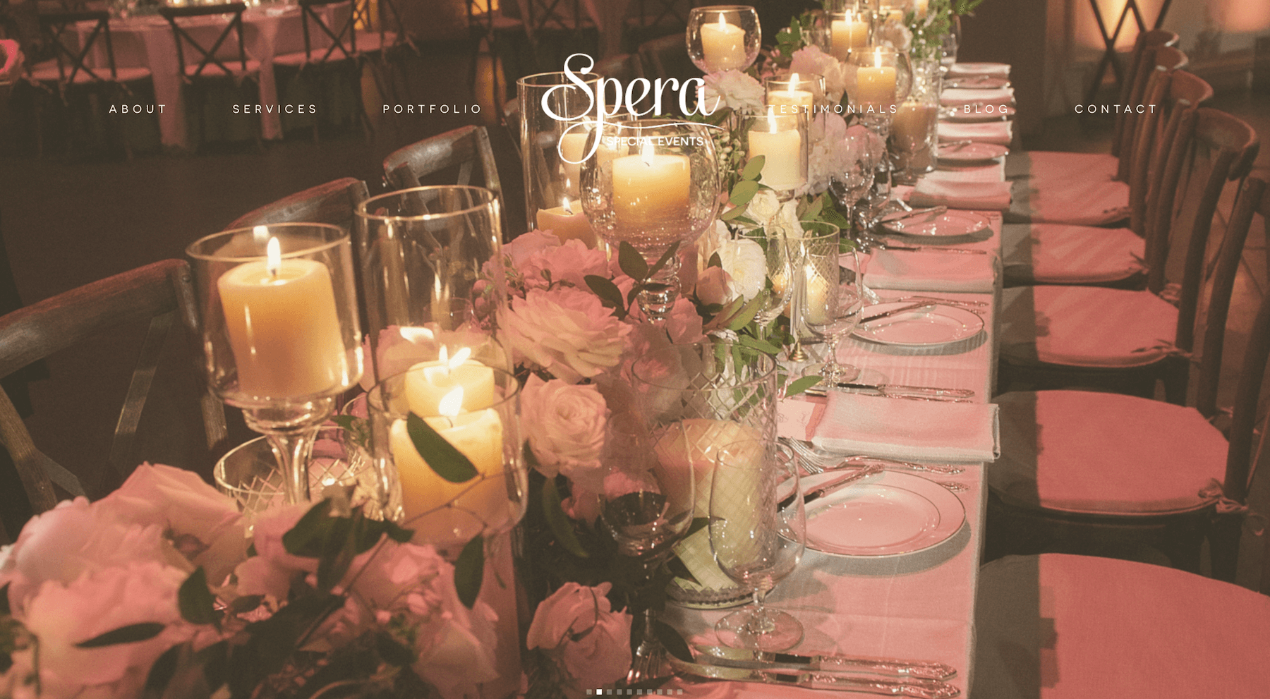
Ok so this business isn’t just a photography service but a full wedding planning service. Nevertheless we love the abundant use of negative space, and the homepage is not a long scrolling one, leaving the user to follow a particular journey.
The portfolio page consists of a handful of chosen previous work, and once again the page is so clean. We love the use of video towards the bottom of the page, keeping the user interested, and it ends with a CTA.
4. Website: Asher Gardner Photography
Designed on version: 7.0
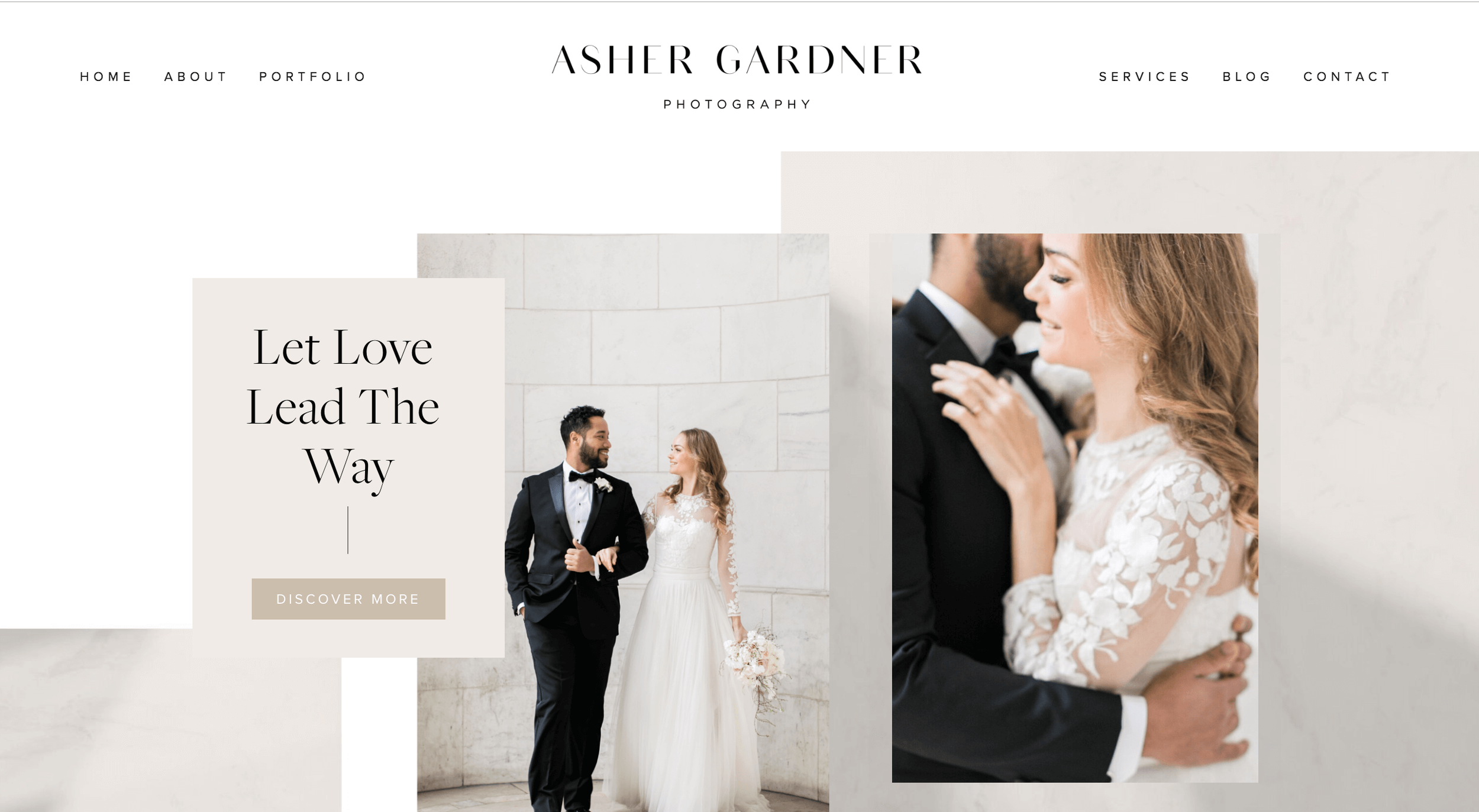
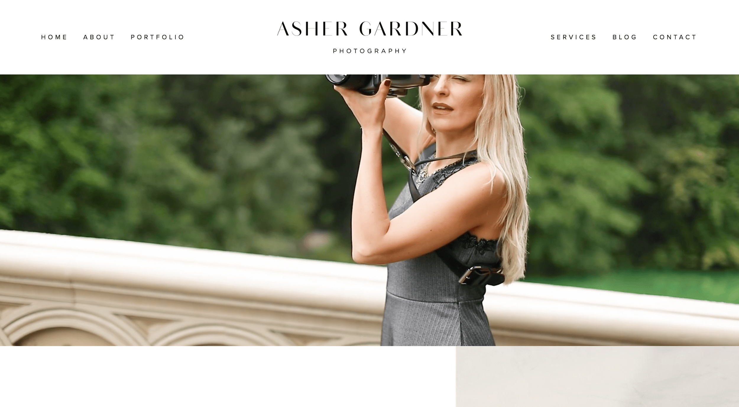
A really chic and modern look, we love this design and how it uses interesting backgrounds throughout. The homepage is very minimal in copy, with the only text being for necessary information. The photography does most of the talking!
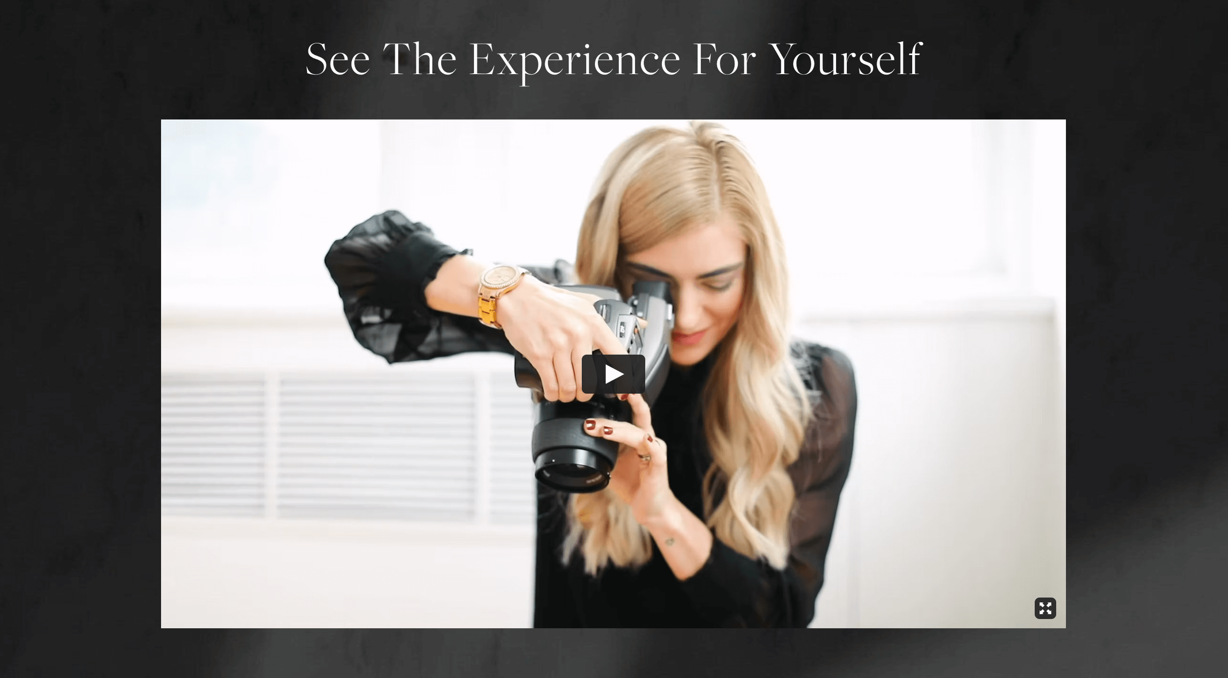
The ‘About’ page starts with a beautiful video of a behind the scenes shoot, showing the photographer in her glory and doing what she does best. Video banners and videos in general are great for SEO (search engine optimisation), as it has the user sticking around a little longer to watch.
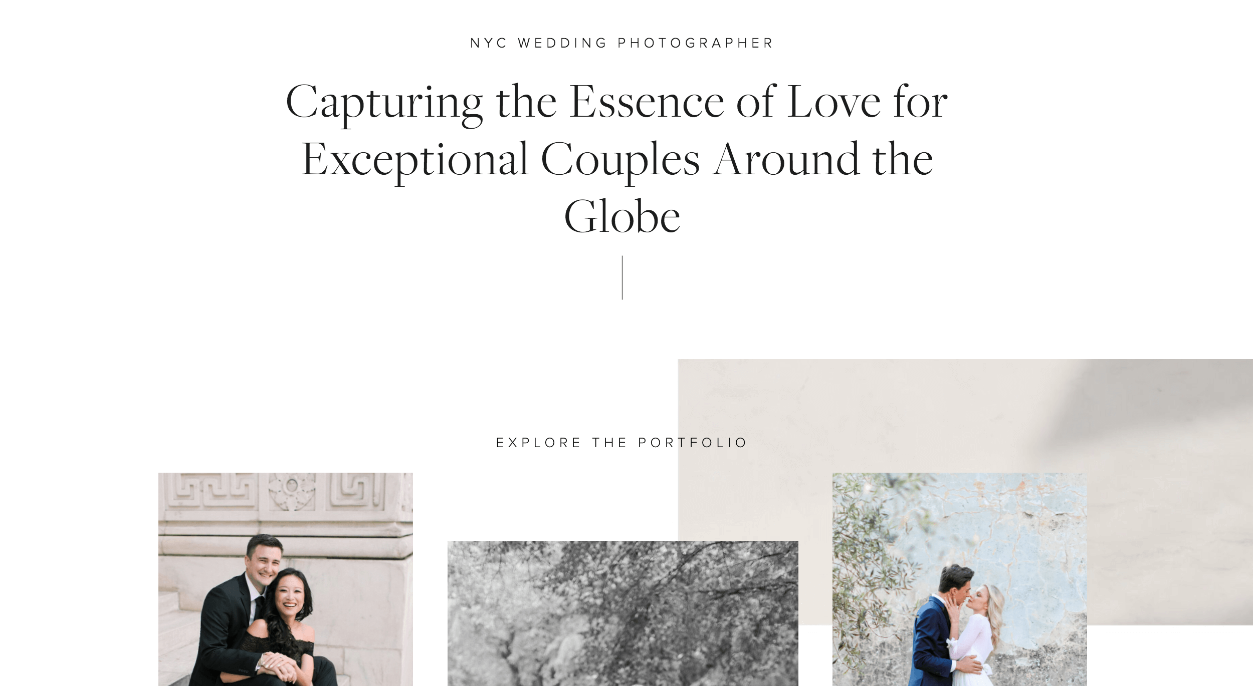
The portfolio page literally consists of only photography, and once again, if no copy is needed then there’s no need to add it!
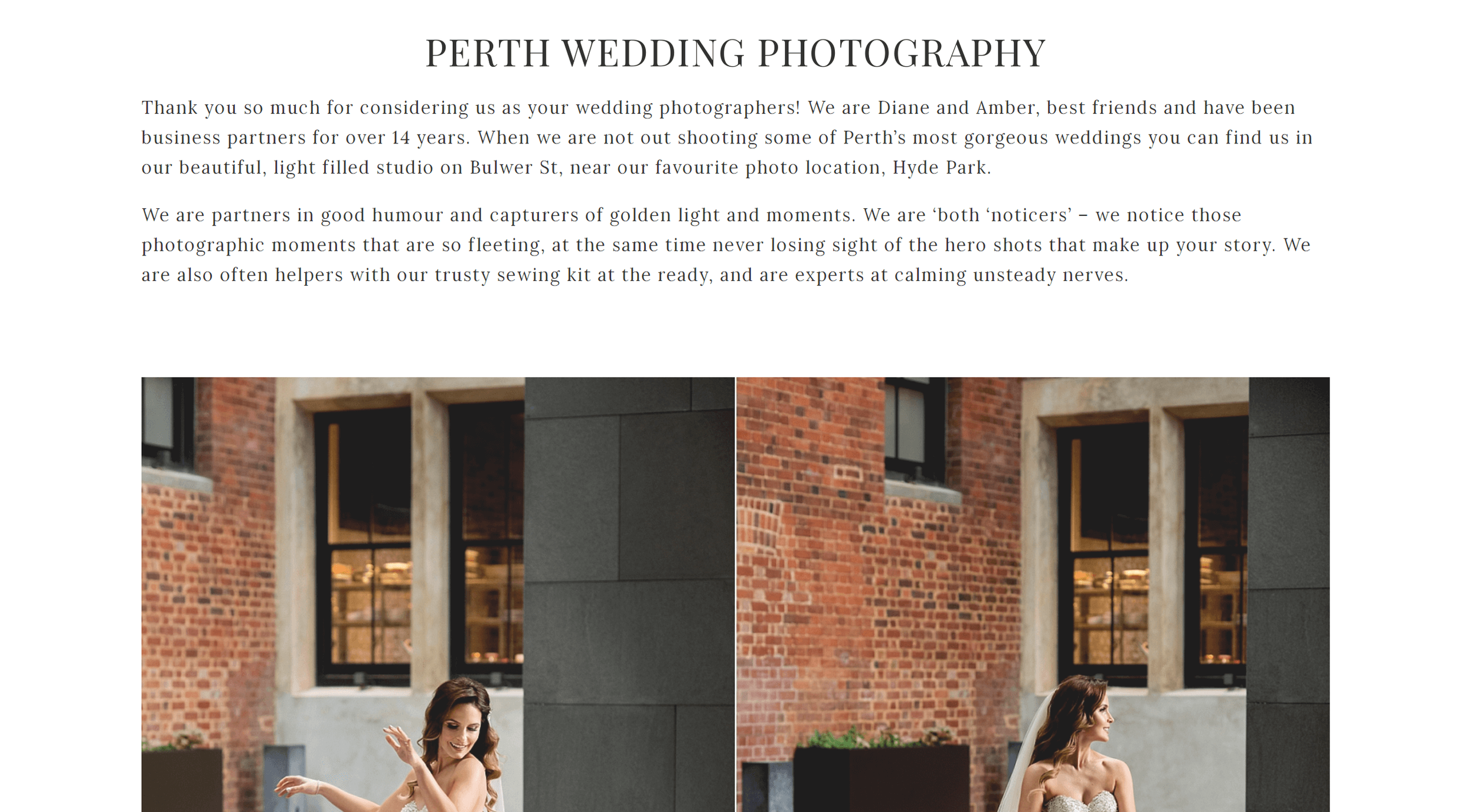
5. Website: Deray and Simcoe Photographers
Designed on version: 7.0
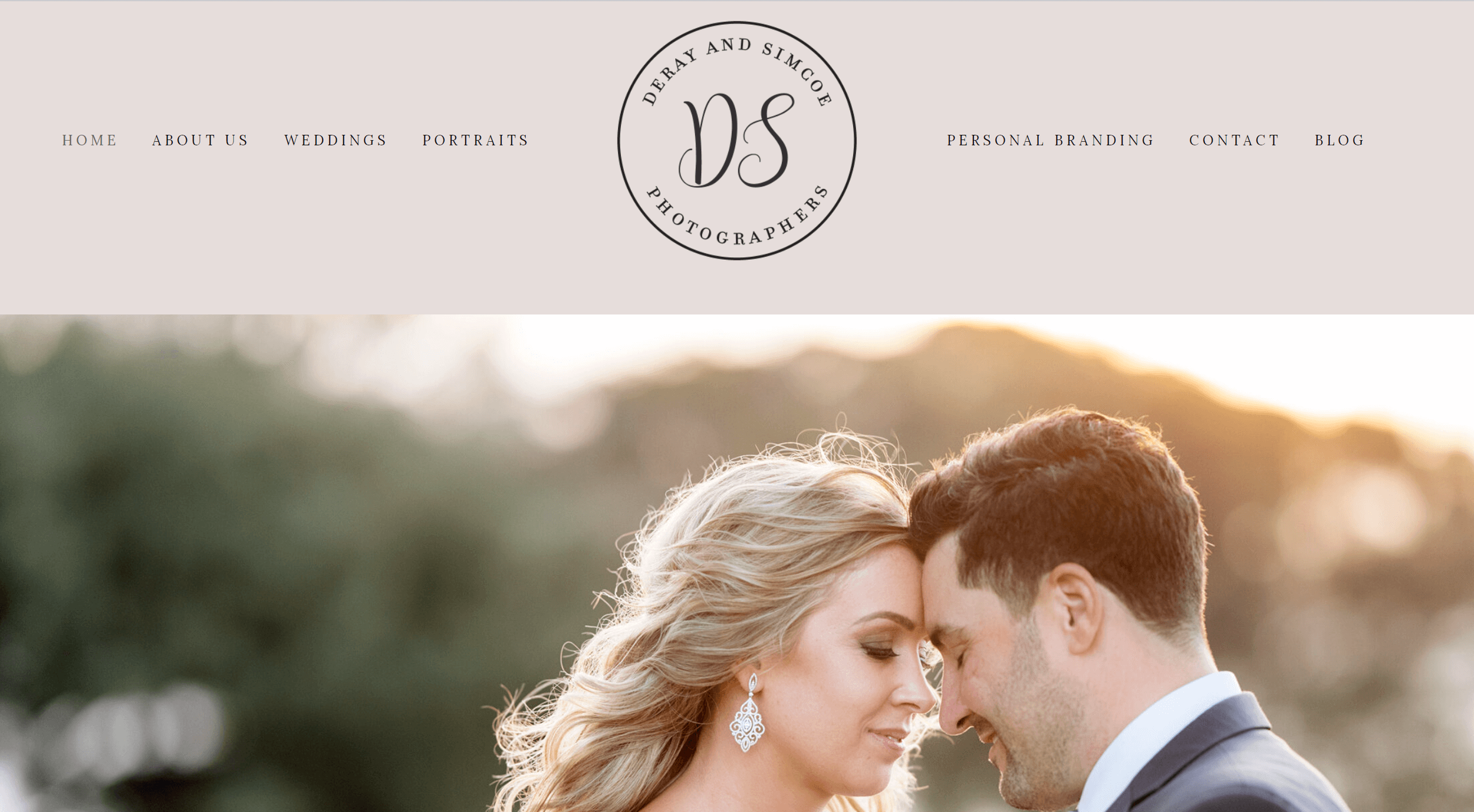
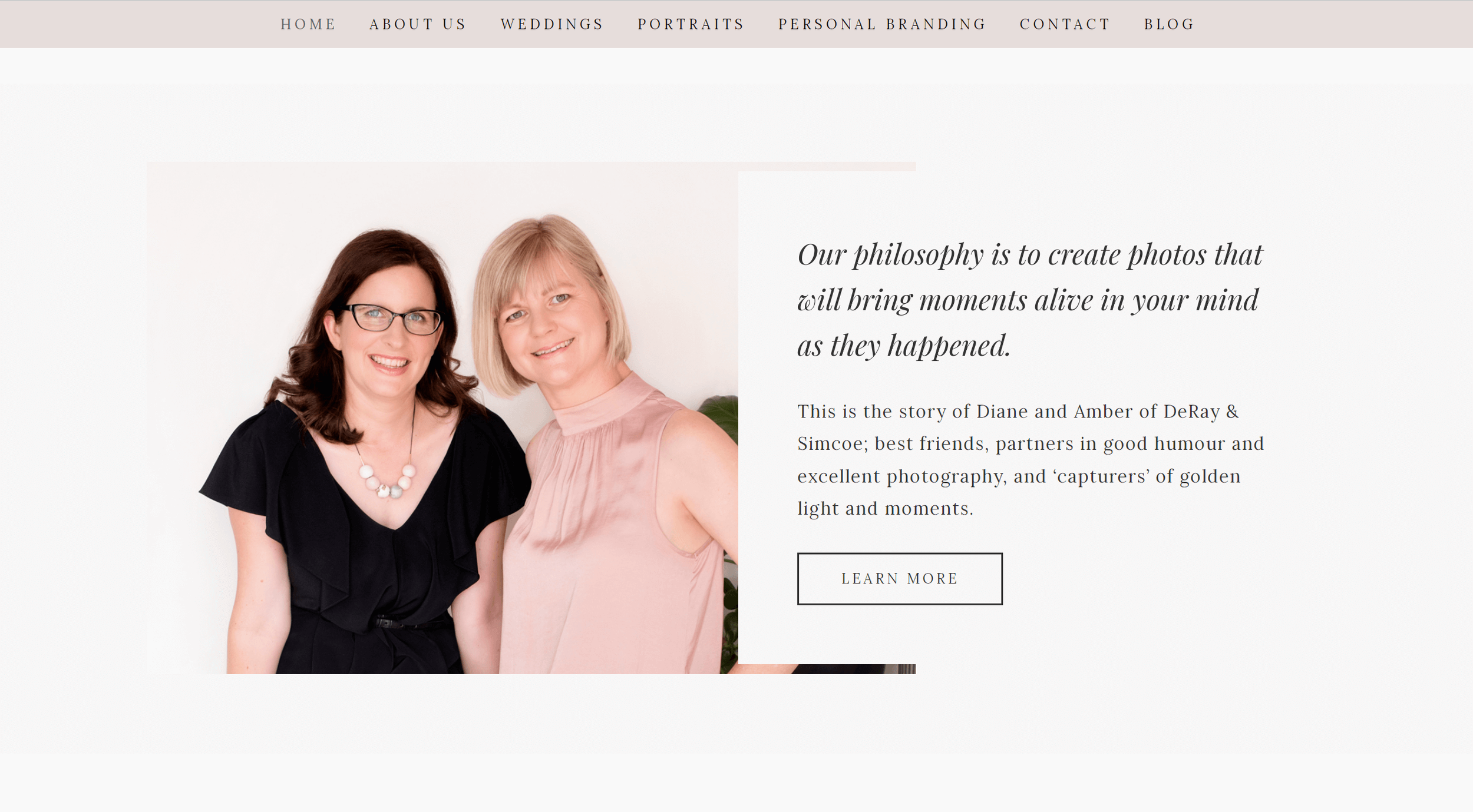
You’re immediately presented with a big and bold primary navigation, and an eye-catching logo. The rest of the homepage is a relatively shorter one. The first part is a slideshow of beautiful images, along with a tagline as well as a great story behind their brand. The rest of the page contains plenty of negative space, with CTAs placed consistently throughout.
Although there is some copy on the ‘Gallery’ pages, all the pages are not long scrolling pages which makes it far less confusing for the user to navigate.
We offer custom branding and website design, so if you’re ready to take your business to the next level, friend, then just fill out our short form and get in touch!


