Squarespace 7.1 newsletter block CSS
Building your email list is one of the most significant methods for growing your business & brand, because it helps you to build a sales funnel and it gives you an opportunity to get into your audience’s inboxes! The newsletter block is an important one for this. In this blog post we’ll walk you through some simple custom codes (CSS) to use on your Squarespace 7.1 website’s newsletter block.
Squarespace 7.1 has many built in features now compared with the older version 7.0, and we’re definitely here for it! But CSS can help with those little customisations which only code will achieve, for now ….
Squarespace 7.1 newsletter block - Site Styles
Let’s first talk about what we can already do on Site Styles, e.g. those customisations which are already built into the back end (and therefore no coding is required!).
If you would prefer to have a quick watch of my demonstration of the basic site styles, then feel free to watch this video here!
Please note: the below video demo is using the classic editor, and not Fluid Engine (for more on Fluid Engine, click here!).
NOTE regarding Buttons styles: I forgot to mention in the video, that when you style your Primary, Secondary or Tertiary buttons, you’re changing the styles site wide, so bear that in mind (and to customise styles for the newsletter block only, this is where CSS comes in).
Change the fonts
You can change the font family, and sizing of the heading and paragraph text in your newsletter block, by heading to the Edit feature of your page. Then go to Site Styles (paintbrush icon) > Fonts > then click onto whichever of the fonts you’d like to change in your newsletter (the site styles page will go directly to where you need).
Once you’re here, select the ‘style’ of the font, and you’ll be presented with a dropdown list of two options. The second option will enable you to ‘customise’ your font specific to the newsletter block.
You can do this for the Heading, and description text.
customising your newsletter text on site styles
Change the button style (including how to make the newsletter block button round in shape!)
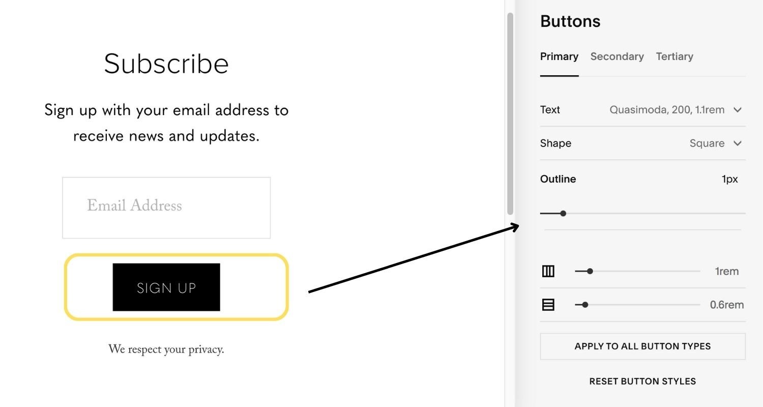
You can change the shape of your button as well as the button text. Head to the Edit feature of your page. Then go to Site Styles (paintbrush icon) > Buttons.
You will see the styling options for sizes Primary, Secondary and Tertiary. You will be able to edit each button’s text, shape (fill or no fill), and give it an outline (border colour). But note, this will change the button style for that particular size, globally, across your site (this is where CSS comes in handy).
customising newsletter button with site styles
Change the colour
Head to the ‘Edit’ function. You can edit the font and button colors, by going to Site Styles (paintbrush icon) > Colors. Go to the relevant colour palette (or Theme) for that section, and then scroll down to get to the Newsletter Block option.
Customising newsletter block colours with site styles
Squarespace 7.1 newsletter block CSS
Squarespace 7.1 newsletter block round button
You can use CSS to only customise the shape of the newsletter button, and not impact site wide styling. Use the following code to customise the ‘roundness’ of the newsletter block button.
You can customise the roundness by editing the ‘border-radius’ in the code below.
Copy and paste the below:
// Full screen wide on mobile view
@media screen and (max-width: 768px) {
width: 100%;
}
.newsletter-form-button {
// Styling the button text and roundness
min-width: 100px;
font-family: "Open Sans", sans-serif !important;
text-transform: uppercase !important;
border-radius: 30px;
@media screen and (max-width: 768px) {
padding: 1.5rem 0 !important;
width: 100%;
}
.newsletter-form-button-label {
font-size: 1rem !important;
font-weight: 600;
letter-spacing: 1px;
}
}
newsletter block round button css
Squarespace 7.1 newsletter block background colour and sizing
Use this code to change the background colour of the newsletter block, as well as customize the size of the email field.
Customise the background colour using the Hex code of your preferred colour.
Copy and paste the below:
// newsletter customisation //
.newsletter-form { background-color: #F6FBFF !important; padding-top: 5% !important; padding-bottom: 5% !important;}
// size of the description text //
.newsletter-form .newsletter-form-header-description {font-size: 20px !important;}
// size of the newsletter email field //
.newsletter-form .newsletter-form-field-element {padding: 0.5em !important;}
newsletter block background colour css
Squarespace 7.1 newsletter block background image
You can even add a background image to your newsletter block. This code is useful for when you want to only make this specific to the block, and not to the whole section (you don’t need CSS for that).
Copy and paste the below:
// newsletter subscription block background image // .newsletter-block {background-image:url(image url goes here); background-size:cover; border-radius:25px}
This code requires a couple more steps.
Once you’ve pasted in the code, scroll down to the bottom and you will see an option to ‘Manage Custom Files’. Click this, and select ‘upload image or fonts’, and this will give you the option to upload the required image.
But wait, in order to make sure your image file is within the sizing limits, head to this blog post for some basic sizing instructions.
Upload your image and this will show up along the bottom.
Now, go to the part of the code that details ‘image url goes here’, and overwrite it with the url for your image (to obtain the URL, you can simply click on the uploaded image).
newsletter block background image css
Newsletter block in the footer
A great way of including the newsletter block with a beautiful background image, is by including it within the Footer of your site.
In Squarespace 7.1 you can add background images to whole sections, and by doing this in the Footer, and placing your newsletter block over it, this can look aesthetically really nice and consistent across your whole website!
There is more you can do within the Custom CSS for your newsletter block, and if you would like us to cover more or, if you’re curious about something else specifically, then leave us a comment below.
Check out our latest free resource, which we’ve put together just for you, in order to help you finalize a branded website!


